Costco Travel Theme Park Ticket Selection
Benchmarking studies uncovered major usability issues for Costco Travel's theme park selection process, causing user confusion and hampering sales.
The UX team found ways to overcome the user problems that we found and we boosted theme park ticket sales by over 10% in the process.

Context
Theme park ticket sales is a crucial part of Costco Travel's business since 18% of our vacation package revenue comes from theme park destinations like Orlando and Anaheim, and our buying teams had imminent plans to expand the number of theme park destinations we offered.
When we did a benchmarking study on the theme park ticket selection process, we brought to light many severe theme park ticket selection usability issues that needed to be addressed. Confusion and cognitive overload were weighing our users down, and we knew that if we could solve these issues, theme park ticket sales would increase.
My role
As Manager of UX, I led the effort to redesign Costco Travel's theme park ticket selection workflow.
- I defined the roadmap with product management and engineering.
- I staffed the effort with the right amount of UX design & research support.
- I guided the UX team with prioritization and timely feedback.
- I ensured that the theme park selection workflow exceeded Costco Travel's sales performance expectations.
Objectives
- Resolve user confusion produced by the current theme park ticket selection process.
- Increase sales of theme park tickets on Costco Travel's consumer site.
Results
As a result of the theme park ticket selection workflow improvements, user ratings for ease of selecting theme park tickets rose from 1.9 to 4.3 (out of 5), and task success improved from 12.8% to 93.2%.
The usability improvements increased sales of theme park tickets by over 10%.
Benchmarking the theme park ticket selection process
My initial heuristic evaluations of Costco Travel's site revealed many usability issues, but since UX was relatively new at the organization, I needed to collect data to support my findings so that I could be convincing to stakeholders and demonstrate the depth of the problems I was finding. As manager of the UX team, I leveraged our user researchers to put all parts of our booking workflows under a microscope.
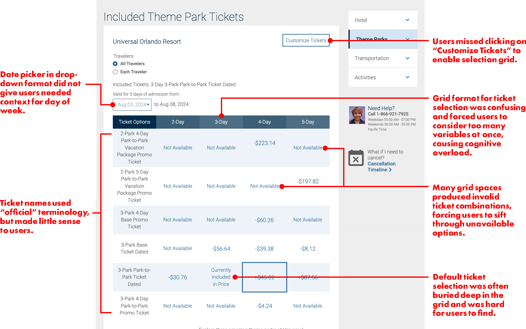
Our benchmarking efforts were invaluable. While problems were found throughout the site, some of the most egregious problems were found in the theme park ticket selection workflow. Task success for theme park ticket selections was at an abysmal 12.8%. Here are some of the reasons:
Defining problems
Our user researchers did a fantastic job of collaborating with designers and stakeholders to describe and define problems with the theme park ticket selection workflow. We met with stakeholders in product, engineering, and buying to show what we found in the benchmarking studies.
Input from these cross-functional teams helped us prioritize this feature improvement as a critical priority and we were able to scope the project in a MVP approach that would allow us to address and deliver critical solutions quickly, and then follow up with refinements later.
We also defined and agreed on metrics (both business as well as usability) that we would use to evaluate the success of the feature improvements. Sales and agent phone calls were defined on the business side, while task success and ease of use were defined as usability metrics.
Output of problem definition activities
- Users do not understand "official" names of tickets and can't make informed decisions about what is included in each type.
- Too many criteria are being presented simultaneously in the selection grid for users to effectively make comparisons about which tickets match their needs.
- Users don't understand that they need to click on "Customize Tickets" before they can make changes to their default selection.
- Many "Not Available" spaces add to the cognitive overload that is happening on the ticket selection grid.
- The default selection is difficult to find in the selection grid.
- The date picker in a drop-down does not give users enough context about the day of the week for them to confidently select the day they prefer.
Ideation, accountability, and design reviews
As we moved into the ideation phase, I needed to make sure that our designers and researcher were collaborating effectively to drive the right solutions. I also needed them to be accountable for their work without micro-managing the project.
I set up weekly project syncs, design reviews and prep time with the designers and researcher where they would formally present their ideas to each other and discuss how well their designs were solving the problems we had uncovered. We were very tightly aligned on the direction of the project and what we would be presenting to stakeholders each week.
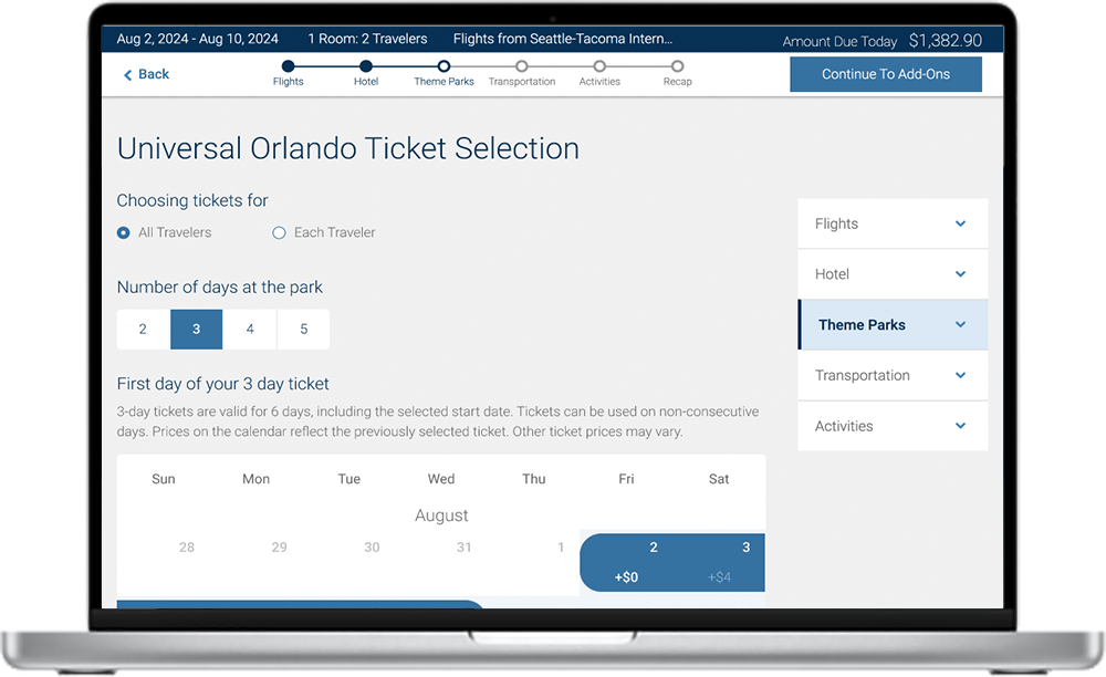
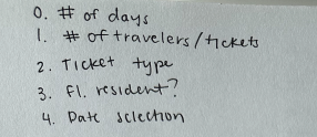
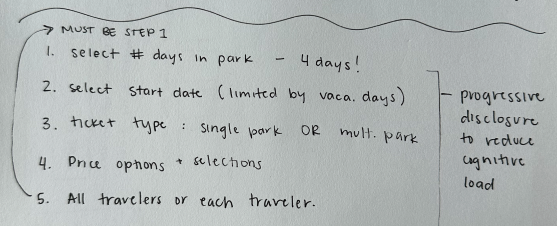
It became very clear to us early on that the key to the success of this project would be found in splitting up the decision making that we were asking our users to do into smaller bite-sized pieces. From there, we were able to put the decisions into an order that made sense. Creating a new flow based on progressive disclosure was relatively easy once we had those pieces in place.
Dividing up the decision-making
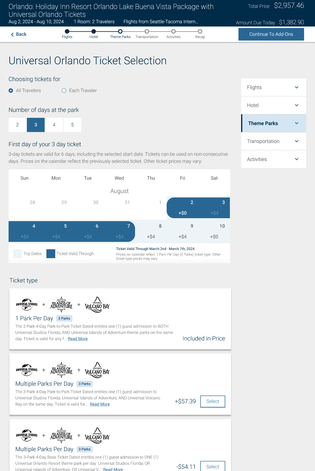
Laying the groundwork for our design through analysis of the problem and sketching out solutions made the final steps much easier. We determined that our users could be guided fairly quickly through theme park ticket selection flow by asking them to make one simple decision at a time. These small steps formed the backbone for the new flow:
- Determine whether they were making selections for the entire group, or just one person at a time (which is unusual).
- Find out how many days they wanted to spend at the resort overall.
- Pick a day for their ticket eligibility to begin.
- Select a ticket type that meets their needs.
Each of these decisions was made even easier by improving the UI and providing the right amount of context as users went through the process.
- Picking a first day of eligibility was done on a calendar-style UI that gave day-of-week context which was important to users. The calendar only showed the days they had already selected for their vacation.
- Ticket types were shown on a series of cards that prioritized scannability to get users to their preferred options faster. Park logos were displayed as well as pills containing important information about each ticket type, such as number of parks per day.
- Extra details that were less important to users were hidden under a "learn more" link that launched a pop-over when activated.
The progressive disclosure approach to helping walk users through the theme park ticket decision making process proved to be very successful in user testing, and it became our recommendation that we delivered for development.
The impact of the Costco Travel theme park ticket selection redesign
After implementing the theme park ticket selection workflow improvements, user ratings for ease of selecting theme park tickets rose from 1.9 to 4.3 (out of 5), and users' task success rate improved from 12.8% to 93.2%. These usability improvements were the primary contributors to an increased sales of theme park tickets of over 10%. Costco Travel is posting best-ever sales and revenue in our theme park ticket sales.
There is still more work to do on the theme park ticket selection workflow. My team is continuously finding opportunities to remove friction and make the process easier and more appealing.
Lessons learned
Power of benchmarking
Benchmarking is a fantastic way to monitor your application for usability problems as well as identifying metrics you can use to measure the success of the improvements you make.
Monitor cognitive load
In this project, reducing the cognitive load by splitting apart decision-making into small steps was key to our success. It was a good reminder that combining elements in an attempt to make things appear less complicated can backfire.
Eliminate the jargon
In an attempt to be precise and correct, Costco Travel ended up with a lot of industry terms and jargon in this workflow that was meaningless to users. Identifying these elements and removing them improved user understanding tremendously.
