
Digital University Learning Journeys
Be a learn-it-all.
Enablement for Adobe customer-facing sales and support employees has always been fragmented. Adobe has many on-demand platforms used for learning: Captivate Prime, Connect, SABA, Spark, and more. User studies showed that it was getting difficult for field employees to know where to find the training they were looking for.
Adobe Digital University was created to centralize the distributed on-demand enablement resources. As the consolidation proceeded, it became clear that a single format for learning needed to be developed.
Learning journeys provide a consistent learning experience for Adobe sales and support employees within Digital University. The standardized format helps learners to immediately know exactly what is expected of them so they can complete their training more efficiently.

My Role
I led the design efforts for this project. I created the wireframes and mockups needed to communicate my ideas for the learning journey design to teammates, stakeholders and developers. Additionally, I conducted several of our discovery interviews and user tests, and collaborated with my teammates to analyze the results.
I also served as the product owner for the engineering team due to my background in front-end web development and agile. I wrote and prioritized their user stories in JIRA, keeping in mind business needs, dependencies and unknowns. I organized the work into sprints and ran the scrum ceremonies.
Methods and Skills
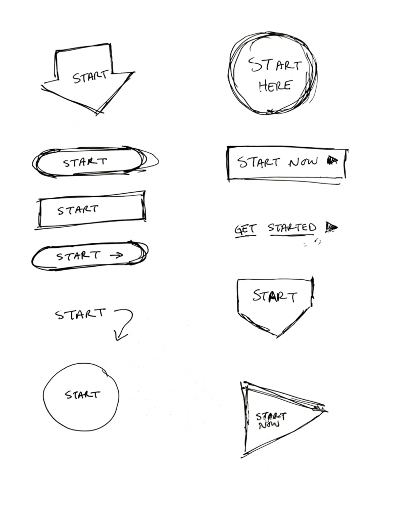
- Sketching
- Interaction design (Adobe XD)
- Wireframing
- Semi-structured interviews
- Usability testing
An innovative integration
Adobe Digital University is built on the Adobe Experience Manager CMS platform. However, most of the on-demand training was created or migrated for Adobe Captivate Prime. We had to build a connection between the two platforms - something that had never been done before - using the Captivate Prime API, which would allow us to design and standardize the learning content presentation on ADU.
In order to determine what design might work best for our standardized learning format, we interviewed twenty users in a semi-structured interview format from around the world. We wanted to get a sense for how they were currently consuming learning content and how it might be improved. In this way, we were able to identify several opportunities for design, including:
Consolidating the content
Because training could be found in many different places and on many different platforms, users expressed confusion about where they might find the content they were looking for. We needed to consolidate it all into a single platform on Digital University.
A single, simple structure
Users also expressed frustration about having to constantly learn a new interface in order to take the training they were assigned. They wanted to have a single format that was easy to use so they didn't have to spend time trying to figure out how the on-demand training worked.
Enhancing the engagement
Many users described the platforms that we were using as unwelcoming and uninspired. We needed to build something that increased their level of engagement by putting the emphasis on making the content accessible and even fun.
These issues led us to define our design problem:
How might we improve the on-demand training experience for Adobe sales and support employees?
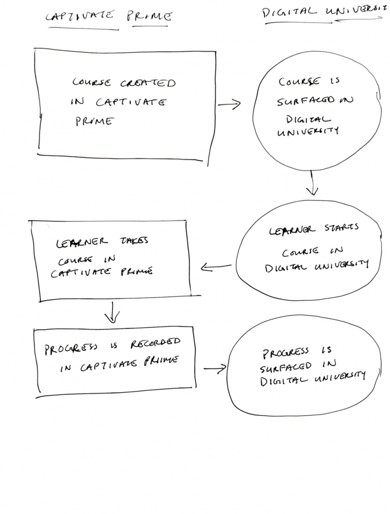
Learning Journey 1.0: creating the connection
The first step we needed to take was to create a connection between Adobe Digital University and the various learning platforms. Because much of the training was being migrated to Captivate Prime, we started by building a simple link between ADU to CP using their API. We could access course descriptions and monitor progress, but users were still taken into Captivate Prime to take their training. This version served as a proof of concept to show that the integration between the two platforms was possible.
Personalized progress
The first version of the Digital University learning journey was limited in scope since it was the first exploration into how to connect ADU to CP. Learners could see the courses they needed to take and track their progress, but they had to take the actual courses in Captivate Prime. Though we had many more features planned, these were selected first for technical reasons, due to the ease of integration.

How we got there
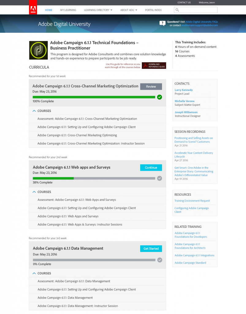
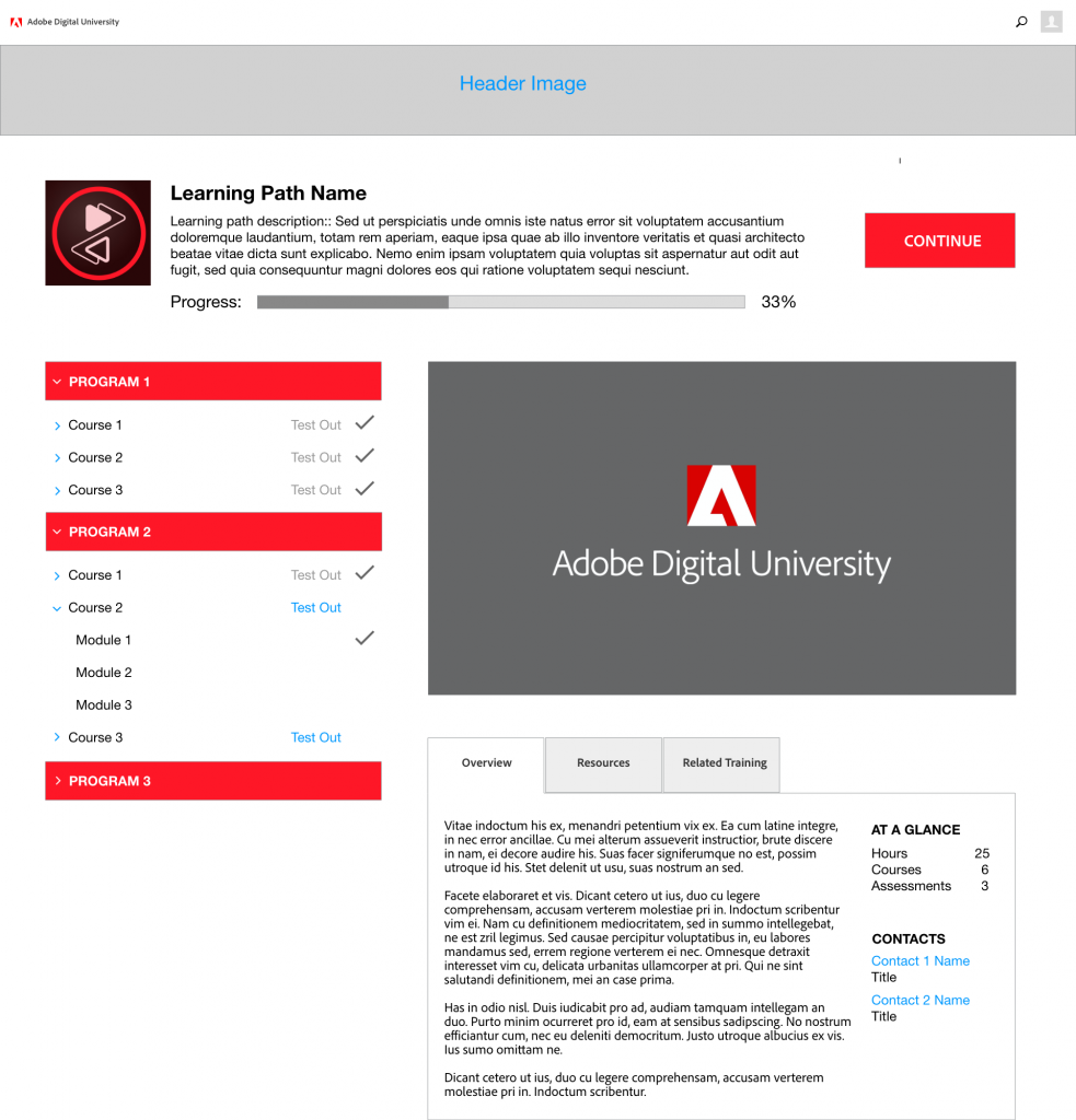
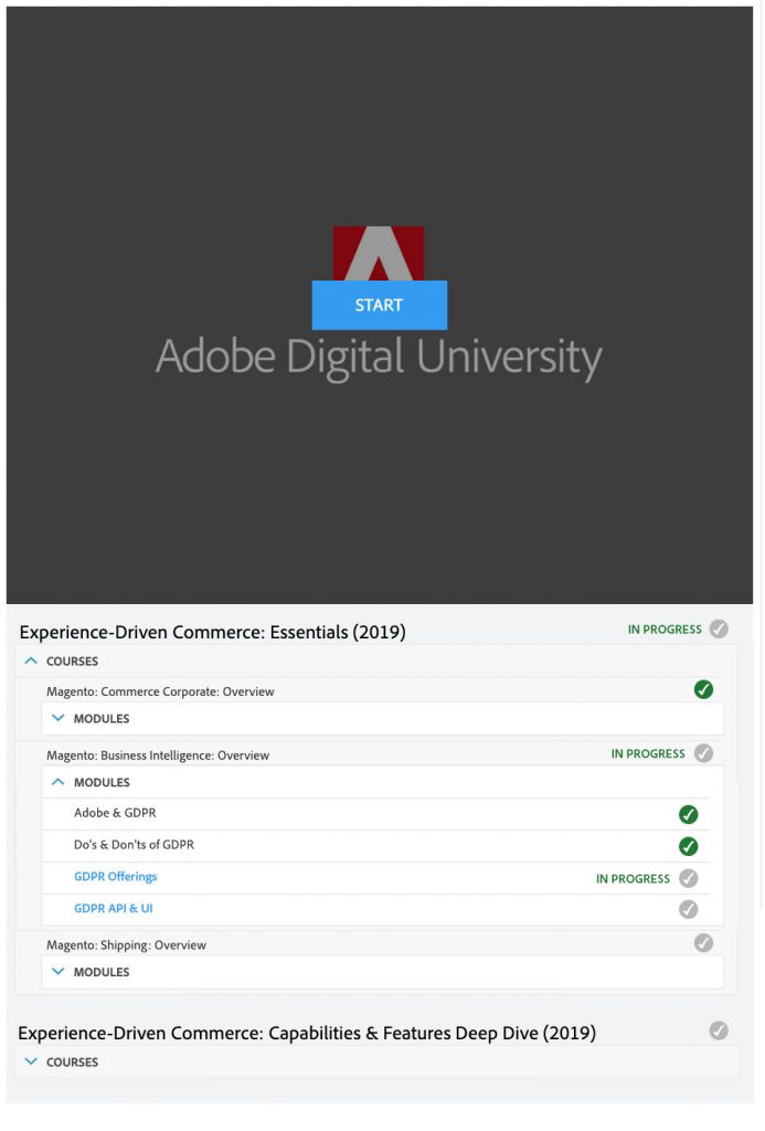
Learning Journey 2.0: an in-page player
After our first learning journey experience was released, learners noted in our user studies that the experience was still disjointed - they could see some of their progress in ADU but they had to take courses using a completely different interface using Captivate Prime. The next step was to bring the actual learning experience into ADU, which was a much bigger and more complex integration, both in terms of design and a development.

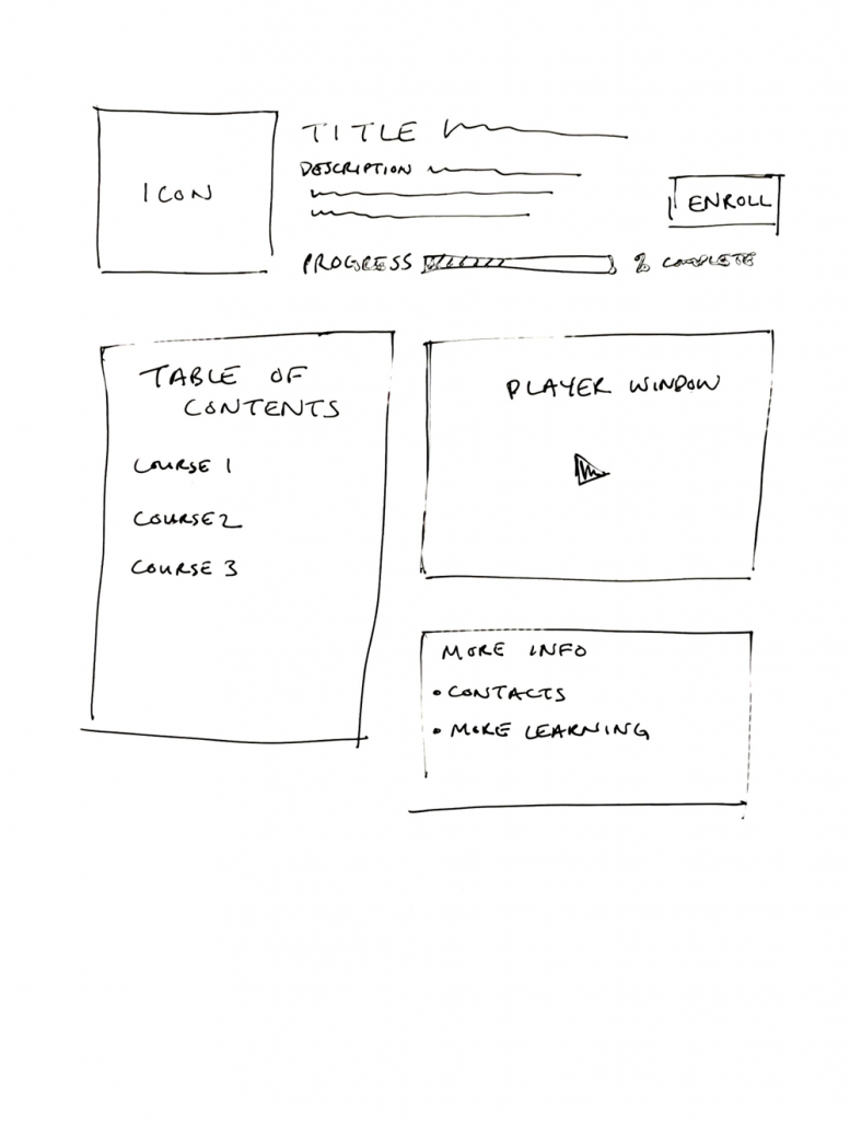
The player window
The player window was finally placed on the page in Digital University. Users could watch videos and take quizzes without ever having to leave ADU.
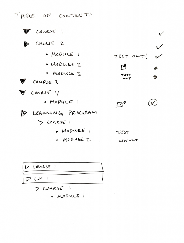
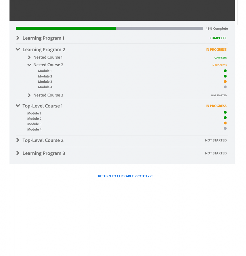
The table of contents
Alongside the player window, the table of contents helped users to navigate through the training content. Collapsible drill-downs allowed learners to have both a high-level and a detailed view of the content, and they could quickly and easily find the content that they wanted to focus on.
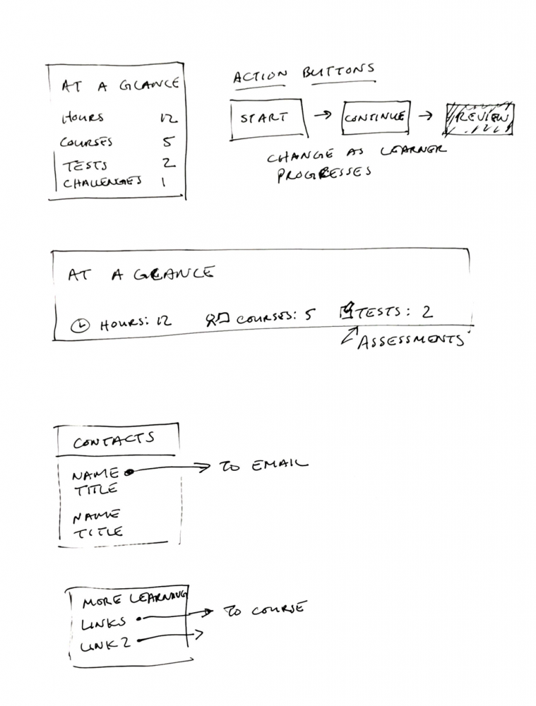
The learning journey progress bar
While we had already implemented a progress bar for individual learning modules, version 2.0 implemented the first "overall" progress bar, one of the most requested features from our user studies.
How we got there
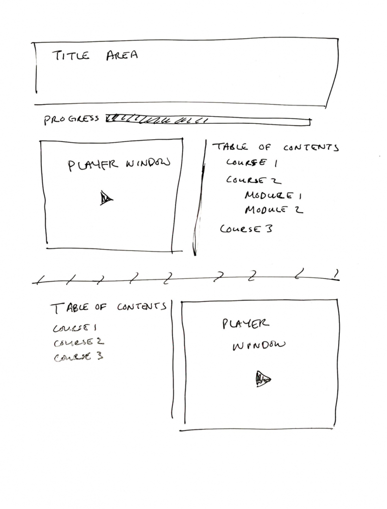
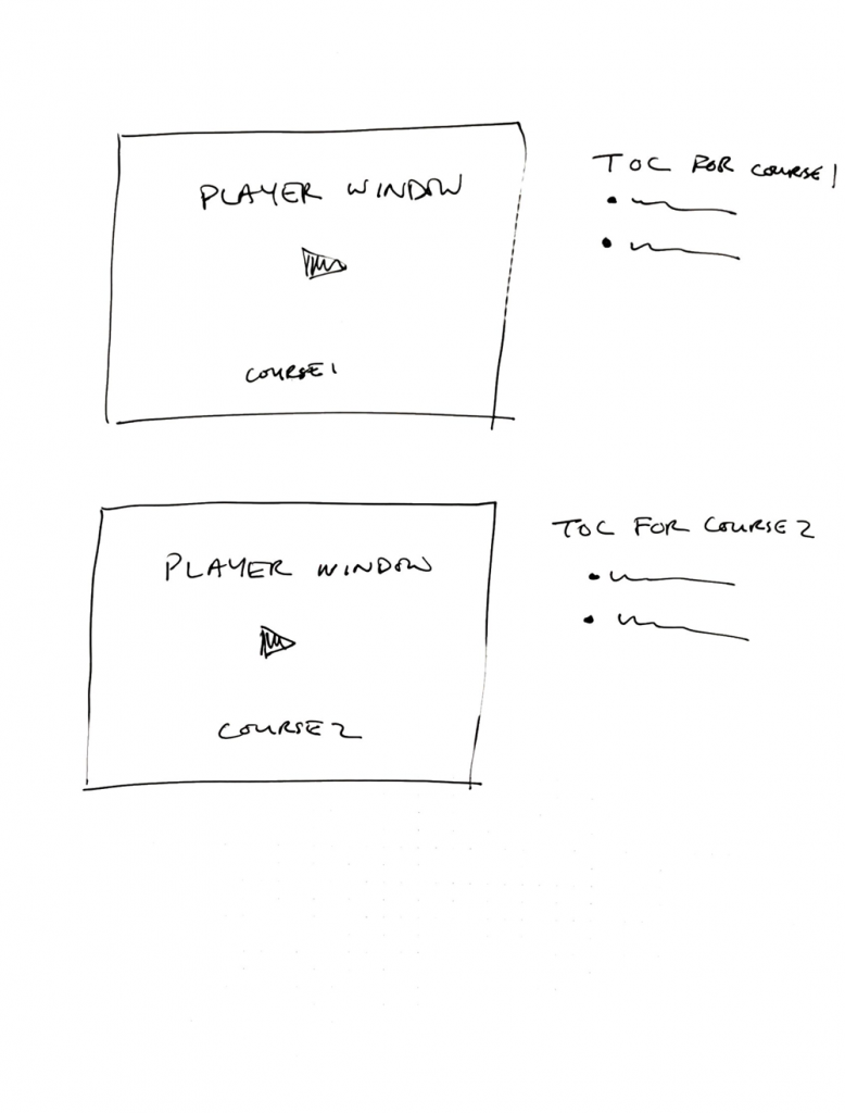
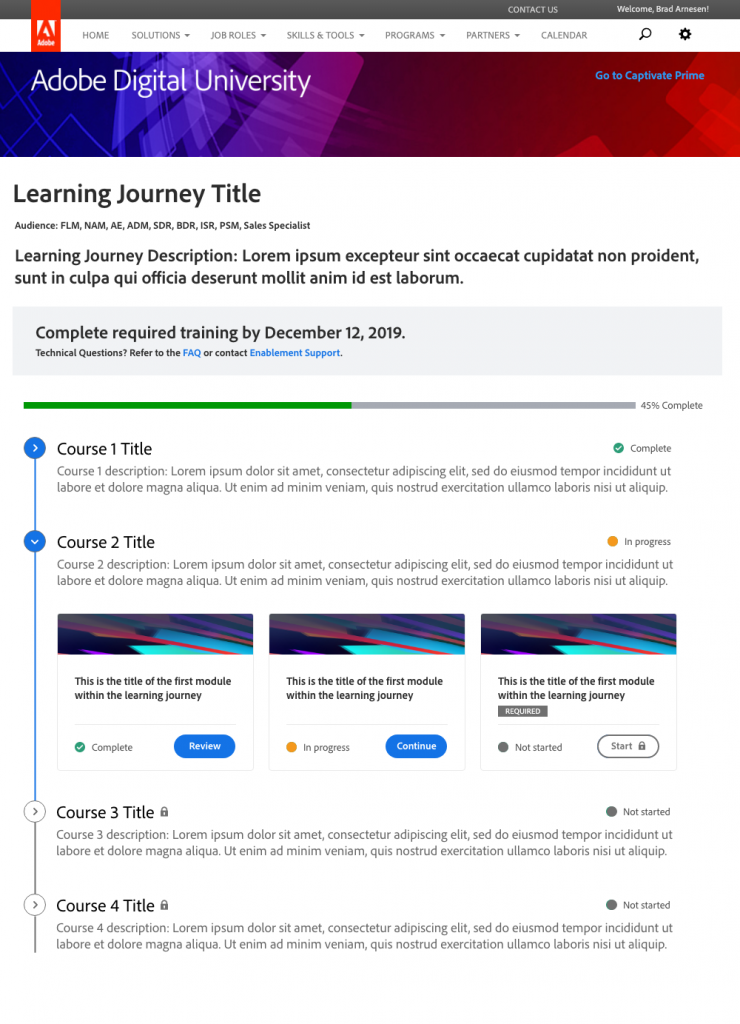
Learning Journey 3.0: expanding the experience
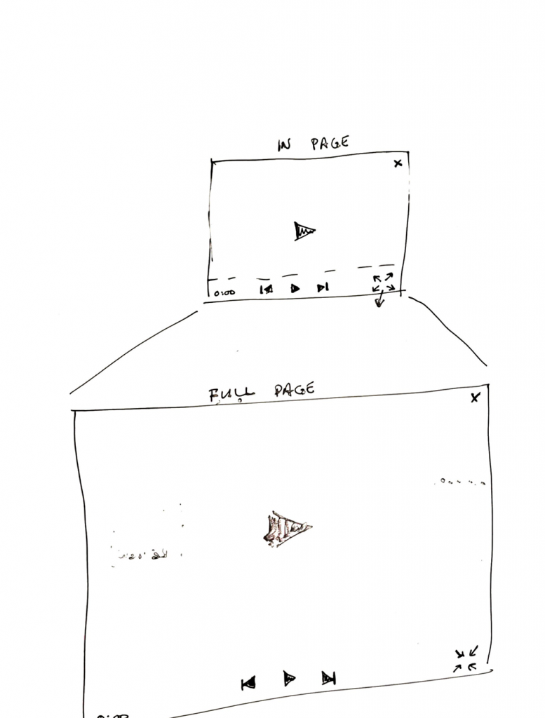
While version 2.0 was well received generally, our user testing revealed more issues that needed to be addressed. One of the biggest issues was that the size of the player window was too small, and even though there was a "full-screen" button, many learners did not discover it on their own. Additionally, users often found progress hard to track on individual items.

Widening the window
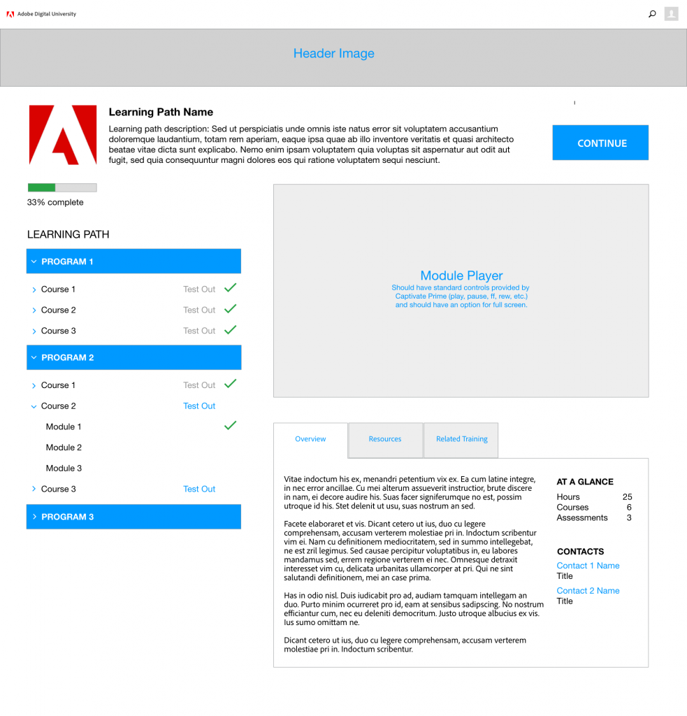
Version 3.0 introduced a much larger, full-width window that made watching videos, reading text and clicking on items in quizzes much easier. The table of contents was moved below the content window to accommodate the full width player.
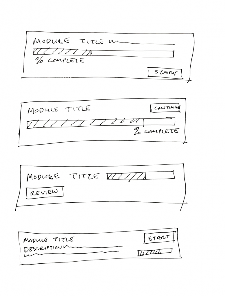
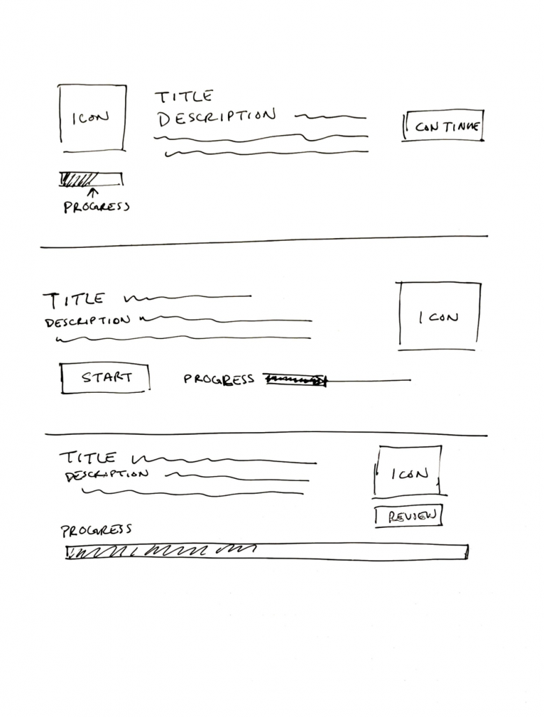
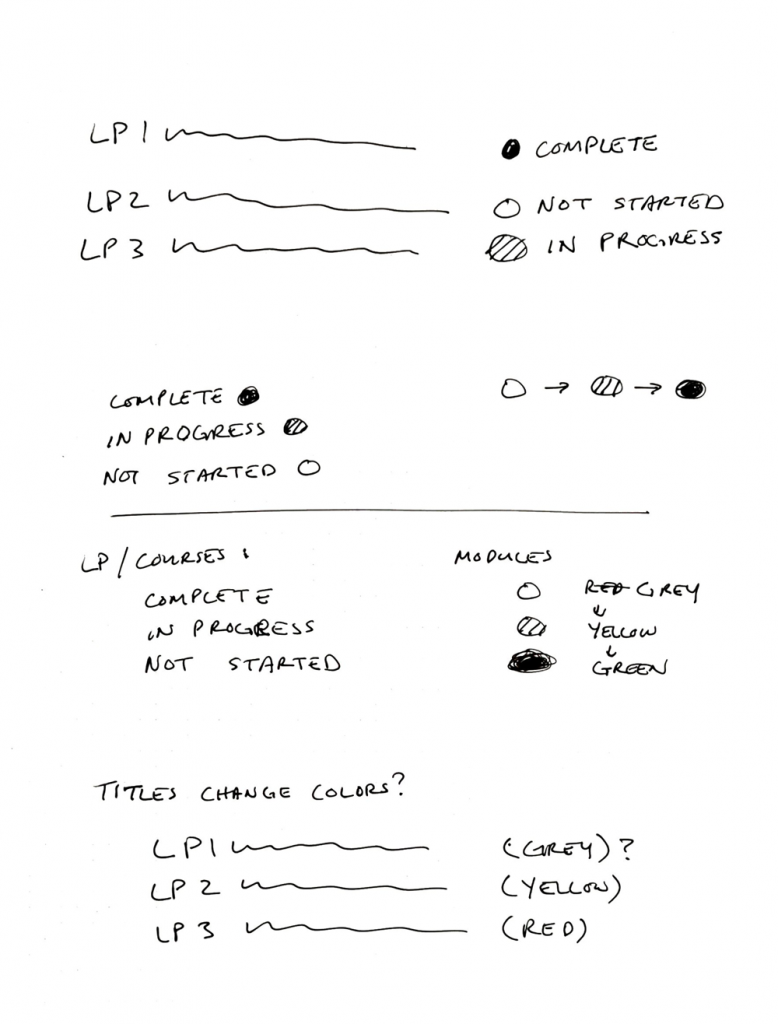
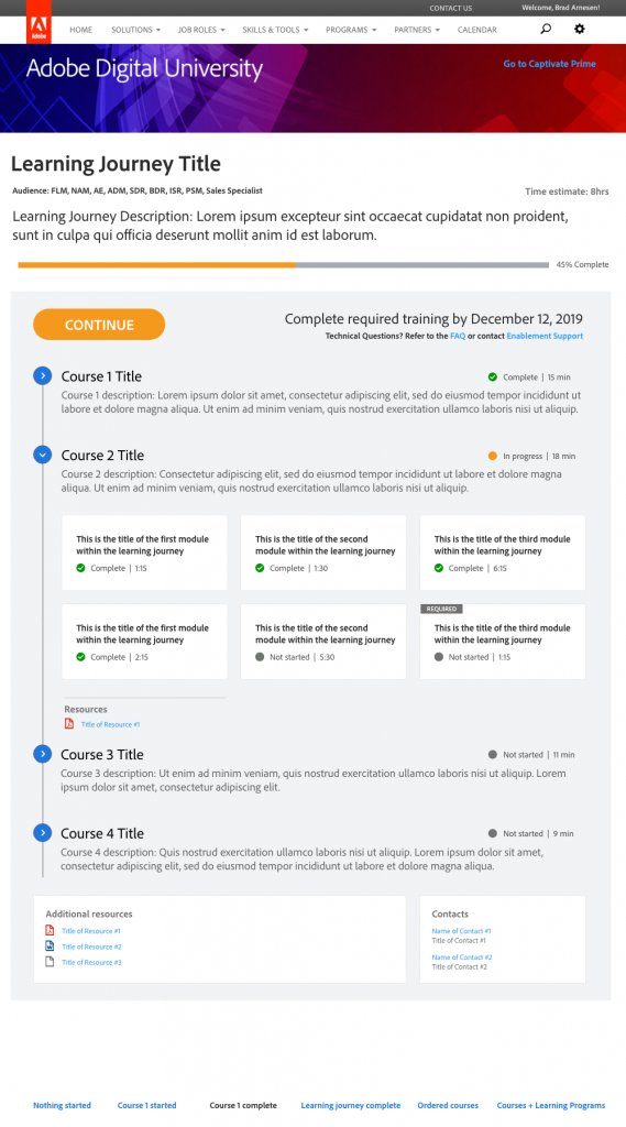
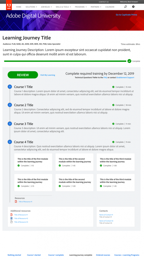
Going green
Individual module completion markers were all enlarged and followed a progression from grey (not started) to orange (in progress) to bright green (complete). Our studies showed that making completion more prevalent helped users track their progress better and gave them a sense of accomplishment.
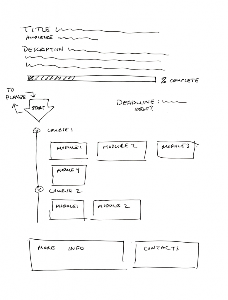
Added info
We discovered that learners needed more information to help them decide whether or not to take a learning journey. Things like target audience, deadline, and a help link were all added to the layout.
How we got there


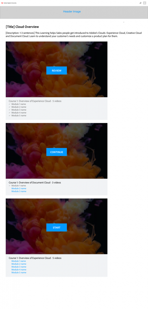
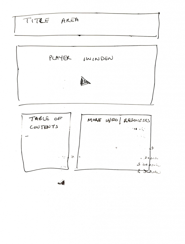
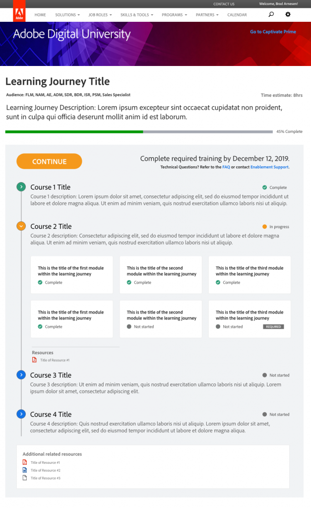
Learning Journey 4.0: emphasizing engagement
User studies showed that version 3.0 was a vast improvement over 2.0, but there was still room for improvement. One of the biggest issues was that the player window got to be so large that it pushed the table of contents too far down the page, forcing users to scroll past it when they wanted to explore the course. Since users indicated that they typically like to explore the course before starting into it, we had to re-think the layout.

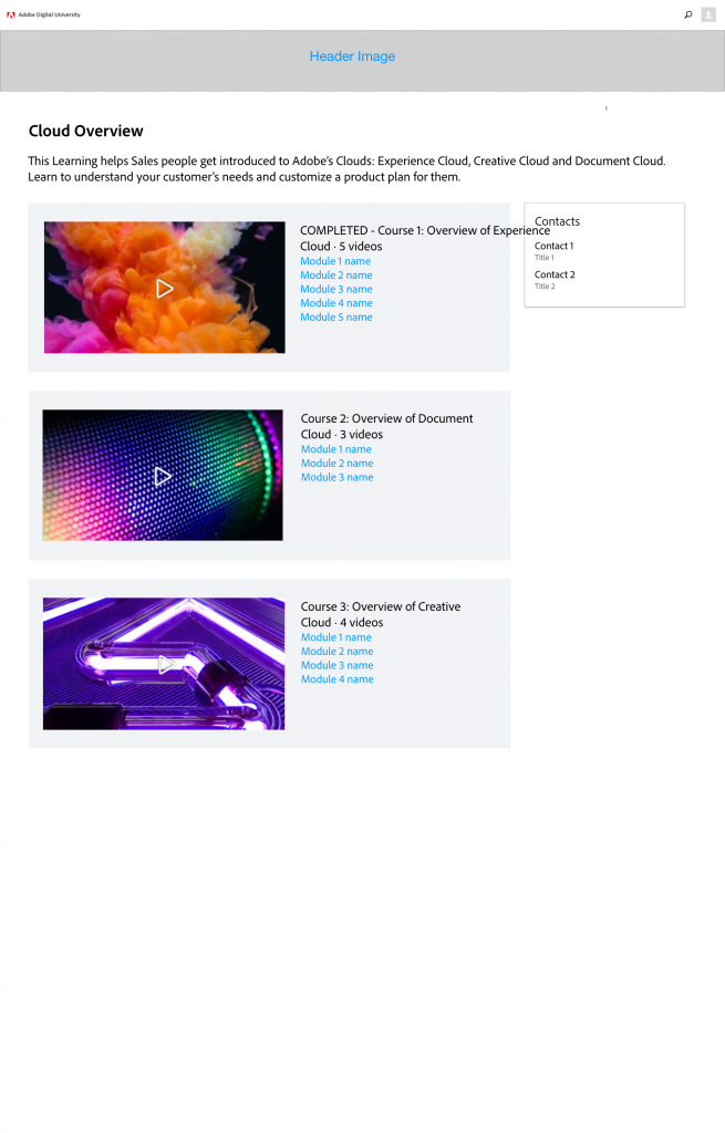
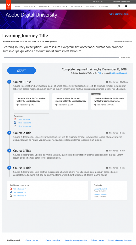
Surfacing the specifics
We removed the player window from the page altogether and brought the table of contents up to the top. This allowed users to start exploring the course as soon as they landed on the page without having to scroll.
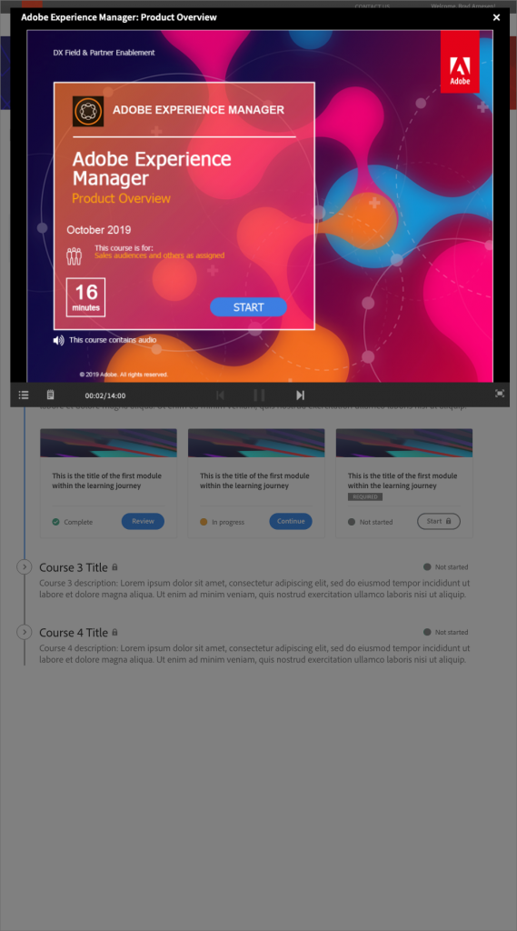
The overlay player
Also at the top of the page is a prominent "start"/"continue" button. When the user is ready to jump into the course content, they can click on this button to launch a full-screen overlay player. The overlay player fills the entire browser screen and offers a much more engaging experience for learners.

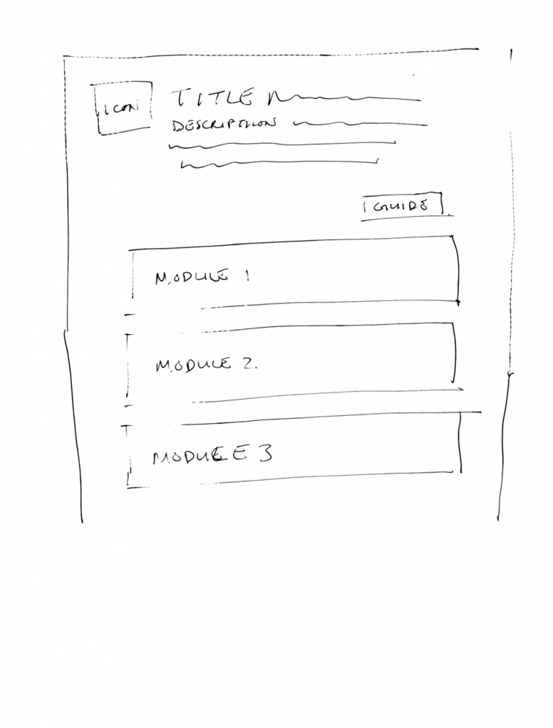
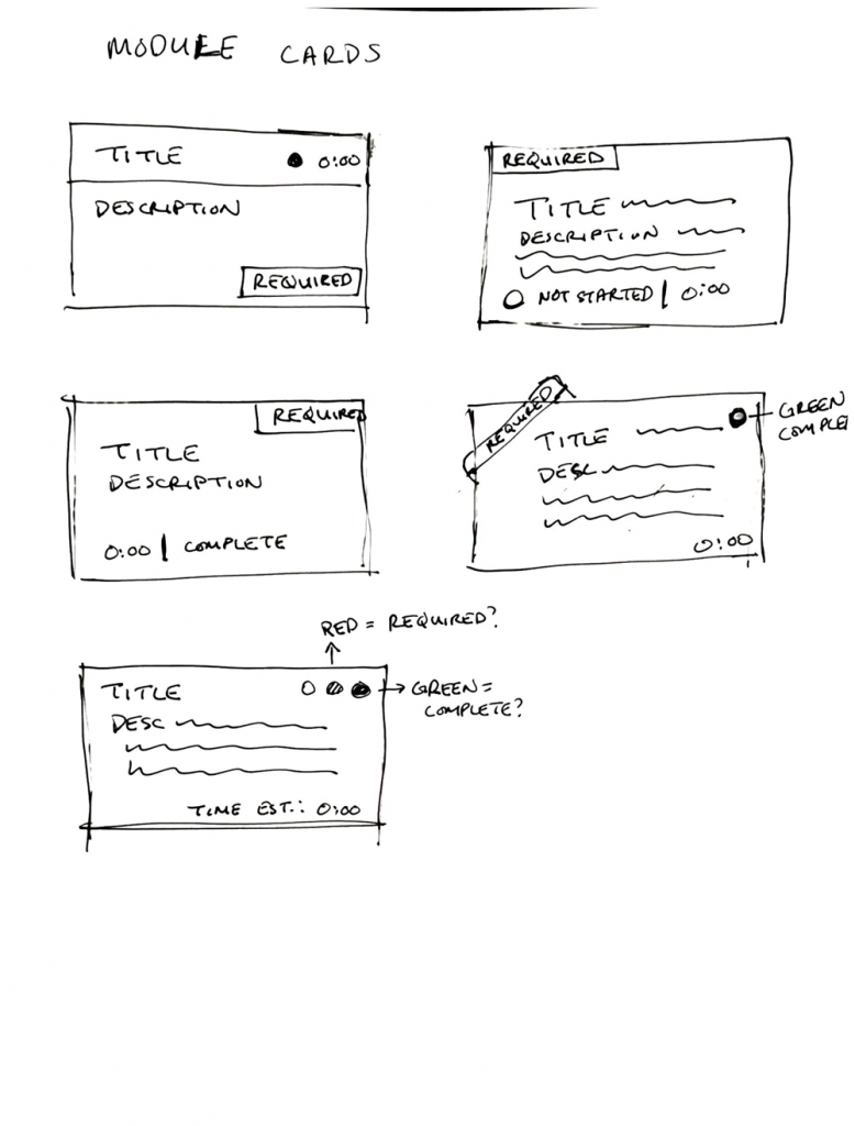
Module cards
In an effort to make the table of contents even more engaging, we moved the individual modules from a simple list to a more eye-catching card format, since that is the level that users should be paying most attention to.
Time estimates
Users indicated that it was often frustrating to open a training and discover it was much longer than they had anticipated. In order to address this concern, we also added time estimates for each module to help learners plan their training and know what to expect. This has helped learners to better engage with the content when they are ready to engage.
How we got there

Lessons learned
Iteration station
Each user study that we did on each iteration of this tool led to more insights about what learners were looking for and ways that we could improve the product. This process led us in directions that we could not have anticipated at the beginning of the process, and helped us to build something truly useful and engaging for our users.
Lead by design
As the lead designer on this project, I learned how to communicate and present my ideas morre effectively to both my teammates and my stakeholders. Customizing my messaging about the design to the things I knew they cared about helped me to gain the buy-in I needed to move the project forward.
The importance of relationships
As product owner, I knew I needed to get a lot of output from my developers in a fairly short amount of time. I invested a lot of time into building a rapport with them, ensuring that communication channels were always open so that they would feel comfortable coming to me with any issues they were facing so we could resolve them quickly.
The impact of Digital University Learning Journeys
The Digital University learning journeys have been well-received by learners and have led to highest-ever completion rates of training by the field, often hitting 95% and above, a benchmark we had never achieved before beginning this project. The latest learning journey design iteration has been applied to all courses on Digital University, and we continue to enjoy high levels of satisfaction with the training that our learners are completing.