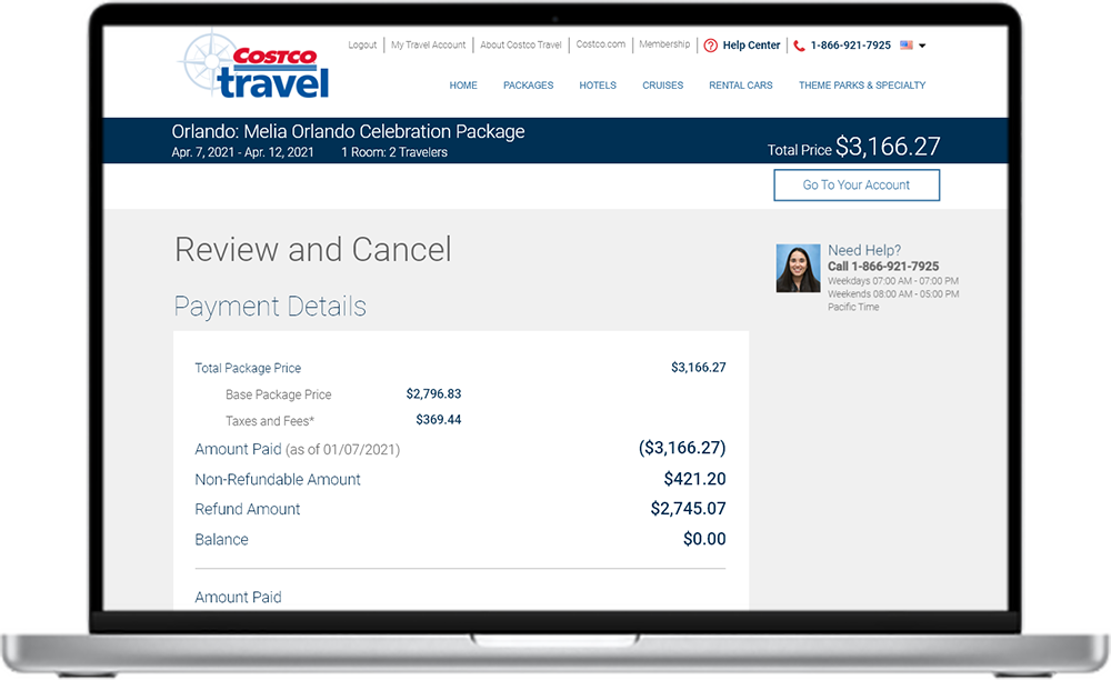
Costco Travel Self-Service Cancellations
At the height of the COVID pandemic, Costco Travel's call center was overwhelmed with cancellation calls.
My team enabled Costco Travel's members to self-service cancel their trips and get refunds and credits via the website.

Context
With COVID on the rise, borders were shutting down and travelers were worried. Costco Travel was facing an unprecedented wave of cancellations and the call center experienced hold times of over 8 hours.
We proposed self-service cancellations as part of the solution to the problem, and my team was activated to design a way for users to cancel without having to talk to a call center agent.
My role
As Manager of UX, I led a high-visibility and high-pressure effort to design the cancellation workflow for Costco Travel's website.
- I gathered project requirements from agents and stakeholders.
- I staffed the effort with the right amount of UX support.
- I guided the UX team with prioritization and timely feedback.
- Overall, I ensured the cancellation workflow was designed to meet our strategic needs.
Objectives
- Significantly reduce the number of cancellation calls to Costco Travel's call center.
- Increase awareness of Costco Travel's new cancellation workflow.
- Retain as many bookings as possible by not "encouraging" people to cancel.
Results
Cancellation calls to the call center were reduced by over 75%, or 2,000 calls on a monthly basis.
The right requirements
My first task was to understand the business goals and objectives for the project and ensure everyone was aligned to them. I spent many hours talking not just to stakeholders, but also to agents (who were solely responsible for cancellations at the time) to understand what concerns users commonly brought up during the cancellation process. The self-service cancellation process needed to be just as easy and satisfying as the existing call-in process, if not more so.
I engaged with a researcher run some foundational studies to make sure user expectations matched with what agents were telling us. We learned a lot about people's experiences with cancellations on other websites - what worked and what didn't.
This process led us to expand the scope of the project to include the email invoice and the member account page in the project since they were so integral to the cancellation experience.
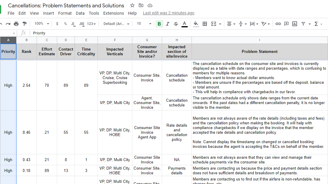
Some of the many requirements organized by weighted shortest job first (WSJF)
Planning for success
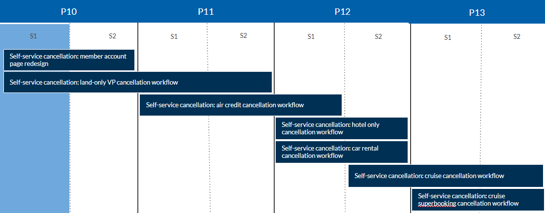
With the requirements esatablished, I began to sequence the design and research tasks. This included prioritizing the work for each vertical based on the impact it would have - since Vacation Packages were our most canceled product, we started our efforts there. The first step was to focus on land-only cancellations, then we upped the complexity with cancellations that included air.
As the project progressed, I brought in more designers to leverage the patterns we established with Vacation Packages and applied them to the other verticals - Hotel Only, Car Rentals, and then finally Cruises - so we could roll them all out as quickly as possible.
Gantt chart showing concurrent designer workstreams
Remote ideation and reviews
As we moved into the ideation phase, efficiency was the name of the game. Business wanted this feature to launch as soon as possible. Since the pandemic had shut down our office and we were all to working from home, we had to establish new ways of working.
I set up daily virtual standup meetings on Microsoft Teams for this project so that the designers and researcher could coordinate their efforts. This enabled smooth handoffs between the designers and the researcher and minimized the wait time between design and testing cycles. We relied heavily on collaboration tools, like Mural and Figma, to share ideas.
We showed the direction of our work to stakeholders on a weekly basis to collect feedback. There were a surprising number of technical and domain requirements that did not surface in our initial requirements gathering, so we had to pivot quickly when needed. In this way, we were able to stay tightly aligned with our stakeholders on the direction of the project.
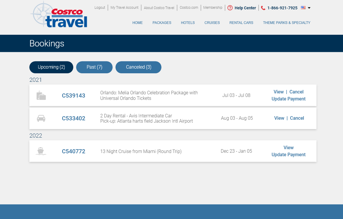
Member account and bookings page redesign was included in the project
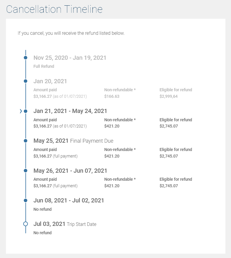
Cancellation timeline improved user understanding of penalties
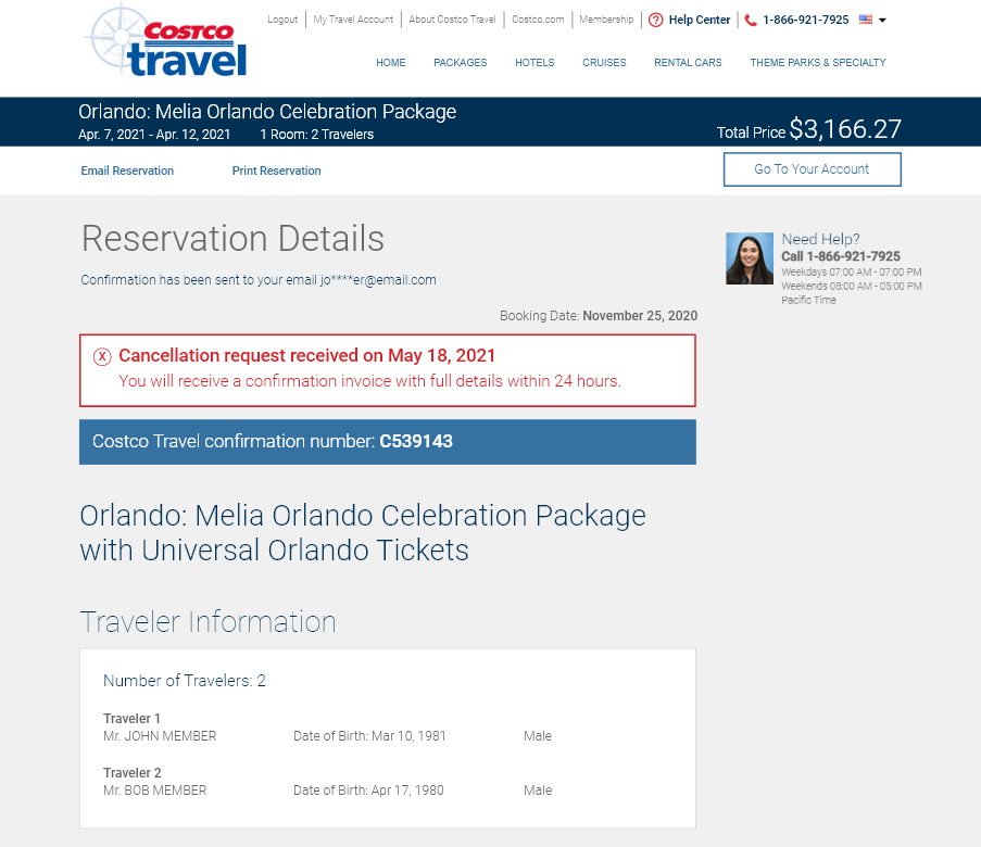
Clear indication that a booking was canceled wrapped up the process
The cancellation timeline turned out to be particularly controversial with stakeholders. Some stakeholders felt very strongly that showing refund amounts might encourage users to cancel more than they would otherwise, and they doubted that users cared much about refund scenarios.
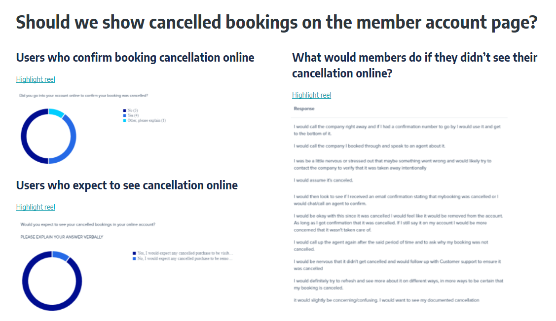
The key to winning over those stakeholders was to take their concerns very seriously and run additional studies to specifically address their concerns. When we showed highlight reels showing how wildly popular the cancellation timeline was with actual users describing how useful they found it to be, the stakeholders who were objecting became convinced that this was the right direction to go in.
Winning over stakeholders
Stakeholders were very skeptical about having a UX team do the work we were doing. After all, UX was still new at the company and our stakeholders had years of experience. They had always had some measure of success by creating their own designs before, and many of them enjoyed the creative aspect of putting together the designs. I had to gain credibility with our stakeholders, fast.
I emphasized to them that our designs were more than just an opinion about how something should be laid out. We were basing our design work in research. I showed highlight reels and statistics to prove that our designs were working. In the end, even our biggest detractors became sold on our process.
Example of a slide designed to convince stakeholders about our process:
Last minute requirement: air credit vs cash refund choice
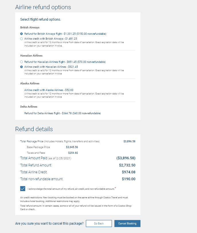
Just when we thought we were almost done with the project, the air department brought up a concern that no one had yet considered: with some airlines, users got to choose between a higher-value air credit and a lower-value cash refund. While we had designed for air credits previously, we had not given users the choice between 2 types of refund.
Because we were on the cusp of launching the new cancellation feature, my team had to scramble to accommodate for the new requirement in the design. It was all hands on deck - everyone had to contribute. I divvied up the work into 3 logical design and research components so we could share the workload, and I expanded our collaboration time. Ultimately I drove the project to a successful conclusion on-time, even with the last minute pivot on requirements.
Design to allow travelers to choose between an air credit and cash refund
The impact of the Costco Travel Cancellations
After the workflows had been launched for all the verticals, the number of cancellation calls to the call center decreased by over 75%. This feature currently saves the call center over 2,000 calls on a monthly basis, or the equivalent of 3 full-time agents.
My team is continuously monitoring the cancellation workflow analytics and continues to conduct usability studies on the feature. We are finding opportunities to remove friction and get users through the cancellation workflow more quickly.
Lessons learned
Credibility is crucial.
Taking the time to win over stakeholders may seem tedious at first, but doing that work early and often makes the rest of the work much easier. As my stakeholders have seen the value of what my team can produce, they have gone from detractors to cheerleaders.
Ask every question.
In this project, some requirements were missed because I could have been more thorough in my work during requirements gathering phase. Asking every question is hard and sometimes annoying, but it sets the team up for better success later on.
Prepare the team to pivot.
Regardless of how thorough you are during requirements gathering, there is always potential for something to get missed or for requirements to change. Having a plan to pivot quickly and re-align resources if needed helps to drive better outcomes and not let deadlines slip.
