Consumer & Business Connection Logins
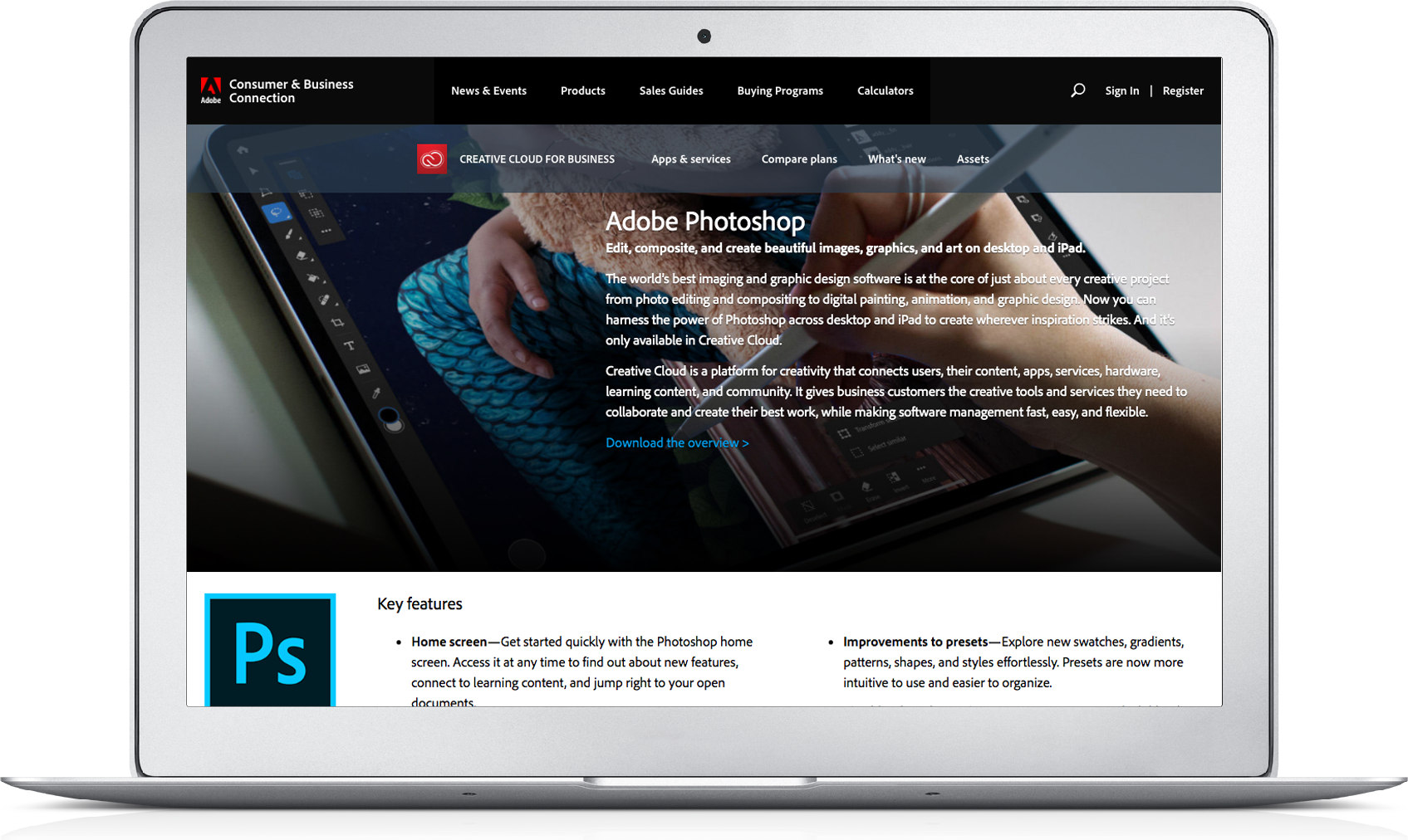
We had just completed a redesign of Adobe's Consumer and Business Connection website, but partners weren't logging in to access permissioned content they needed.
My team stepped in to improve the number of logins that were happening on the site.

Context
Consumer & Business Connection is a public website containing permissioned content that supports a $3 billion business. It provides SMB sales enablement, communications, and marketing for two routes to market – direct and channel.
The site contains a wide variety of permissioned content that partners use to educate themselves and their buyers about Adobe's offerings. But analytics showed that few people understood that they needed to log in to access this content.
My Role
I was part of a team of 3 individuals responsible for the user research and design. I conducted our discovery interviews and usability tests. I created wireframes and mockups to communicate my ideas for the site design to stakeholders and developers.
I also served as the product owner for the engineering team due to my background in front-end web development and agile.
Objectives
- Promote more logins on the site.
- Increase the number of downloads of permissioned collateral.
- Improve page views of content behind login firewall.
Results
After adjustments to the Consumer & Business Connection login process, we saw big gains in all of our success metrics.
Logins increased from just 12% to 68%, and permissioned collateral downloads increased by over 650%. An NPS measurement showed an increase from 5.3 to 9.2.
Foundational research
Analytics showed that only 12% of site visitors were logging into the website, and only 3% of site visitors were downloading permissioned collateral. This was far lower than what we expected to see, so we knew we had a problem. My team stepped in to address it.
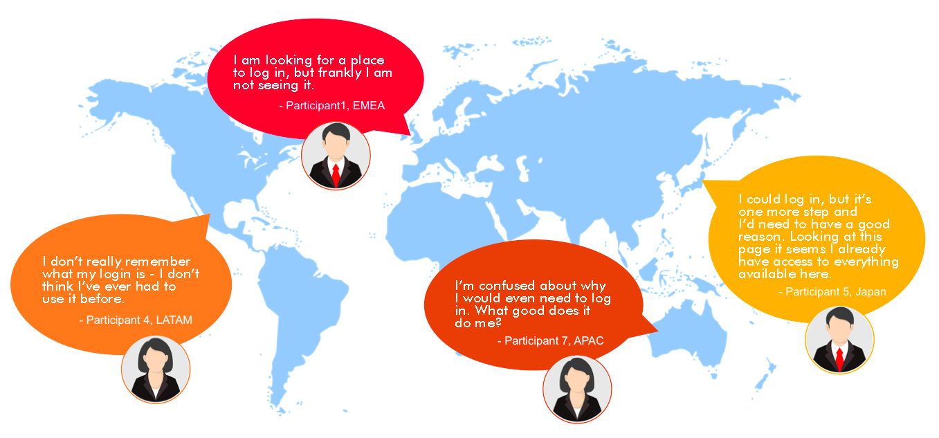
I interviewed eight users from around the world in a semi-structured interview format, making sure to have representation from all the various geos that the site served. We wanted to get a sense for how they use the site, and why they were not logging in. We identified several opportunities for design improvements that would address the login problem, including:
Friction
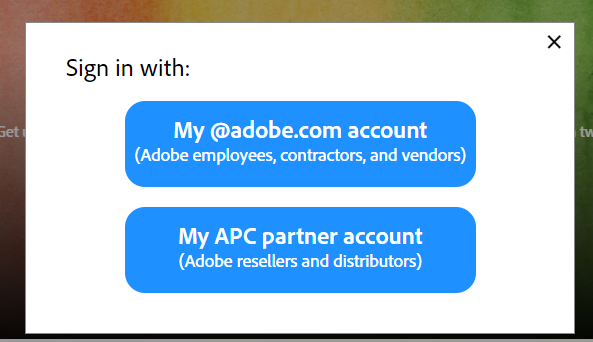
Since the site has two types of users (internal and partners), users had to choose to login as either an employee or a partner after selecting the login link. It wasn't entirely clear to all partners which options they were supposed to pick - they did not all identify themselves as partners.
Enticements
Aside from the login link itself, users had no indication that there might be any additional content behind the login. Because they did not have obvious reasons to login, users simply ignored the login link.
Lack of awareness
Prior to the site redesign, users did not have to sign in to access sensitive content. Even though we sent out emails to educate users that content would now be behind login, not many users paid attention to the emails. Since they weren't aware that the structure had changed, users did not know that they needed to login in the first place.
Ideation and collaboration
I led a series of workshops where the UX and the project team came up with ideas about how to solve the problems we had identified. Lots of good ideas came out of those sessions, and I mocked up the best ideas for testing with users.
Reducing friction
When the re-designed site launched, users needed to choose whether they were logging in as an employee or a partner. This proved to be confusing to some partners who were not sure whether they were considered a vendor or a partner.
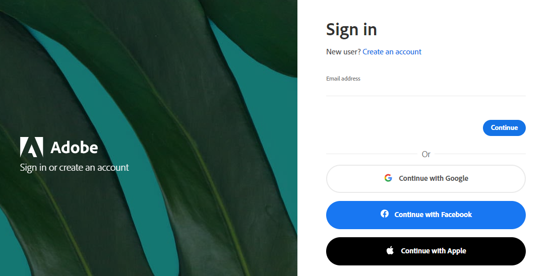
After some ideation and usability testing, we determined that the best way to solve this problem would be to allow users to login quickly using the same login fields regardless of what type of user they were. Additionally, if users are already logged in to another Adobe site, they will automatically be logged in to CBC with a single click.
This proved to be somewhat challenging from a technical perspective and the developers did not initially have a way to accomplish this. But I pushed back on them and ultimately we found a way to make it work.
Enticing users to log in
Since users were not accustomed to logging in to get access to content and assets, we had to surface certain popular items and show users in an intuitive way that they needed to log in to get access.
The first thing we did was to create tags for content to let users know that certain content was targeted to partners or internal employees. This tested well with users and gave them the sense that certain content was privileged. They could see at a glance whether content was relevant to them and helped to pique their interest in the content.
In testing, the tagging proved valuable to users to understand what content was relevant to them, but it wasn't strong enough of an indicator on its own to signal to users that they needed to login.
We added a lock icon in place of the normal thumbnail for some popular content, and we made sure was always displayed in the first position in the assets section on the home page - right below the hero image. Clicking on a restricted asset redirected the user to the login screen. This proved to be the strongest indicator for permissioned content, and in our user testing we had 100% comprehension rate that users could log in to see more content.
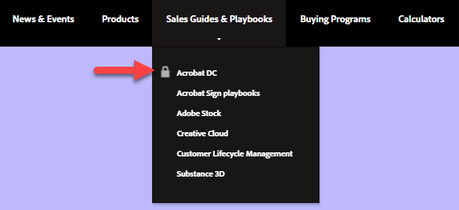
Leveraging the successful lock icon pattern, we also added a lock to certain menu items to show that not only could users log in to get assets, but they could also find sections of the website that contained permissioned content. Clicking on a restricted section redirected users to the login screen. This proved to be highly successful in getting users who were not looking for assets but instead were browsing the site to get them to log in.
Raising Awareness
With the recent site redesign, there was an additional layer of partner-level permissions to make it easier to securely share sensitive announcements and collateral with trusted partners by putting it behind a login structure. Prior to the platform redesign, content on the website was public, so partners were not used to having to login.
We created an enticing message to post in the hero image area that educated users about the benefits of signing in to find the most popular content in addition to content they did not have access to previously. The message included a short video that demonstrated the benefits of logging in. This message stayed on the home page for an entire quarter to sufficiently get the word out about the new login structure.
We also supported the educational efforts by launching a 3-part email campaign to remind partners to log in to the site, and we put messaging on the hold music on the call center help line that encouraged users to log in.
The impact of Consumer & Business Connection login improvements
After adjustments to the Consumer & Business Connection login process, we saw big gains in all of our success metrics. Logins increased from just 12% to 68%, and permissioned collateral downloads increased by over 650%. An NPS measurement showed an increase from 5.3 to 9.2.
The site has been so well-received that it has started to take additional functionality, such as on-demand training content. Content and features from other partner sites will likely be added to CBC in the near future.
Lessons learned
Overcoming the imposter
This was my first major project at Adobe, and I have to admit that I was pretty nervous going into it. I was suffering from imposter syndrome, never having done a project at this scale before. But as I took it one step at a time, somehow it all added up to something that was meaningful and significant. I learned that I can accomplish big things that provide value to people, which is why I got into this business in the first place.
Testing, testing, testing
We did a lot of testing for this project because of the complexity and strategic importance of the site. We facilitated several usability tests with prototypes of varying levels of fidelity. Every test we ran yielded new insights which helped shape the end product into something much more useful and successful than it would have been otherwise.
No dead ends
The simplified login design was tricky for the developers to implement - they were facing some serious technical problems that required a solution from someone within Adobe's vast network. At times it was very unclear how I would get issues resolved that seemed over my head. But tenacity paid off, and I ultimately was able to find the solutions I needed by fearlessly reaching out to find someone who was willing to help.
