Costco Travel Design System
Costco Travel's public facing website was suffering from an identity crisis. A poorly defined style guide led to teams interpreting designs in diverse ways, which in turn resulted in a disjointed experience for users.
The UX team stepped in to restore order and consistency for users, and to improve efficiencies for teams.

Context
Costco Travel lacked a comprehensive design system that unified our brand. The style guide that we were using was created by a vendor that did not put much thought into how it would be used. It was fragmentary, outdated, and it left too much open to interpretation. Additionally, it did not fully account for accessibility.
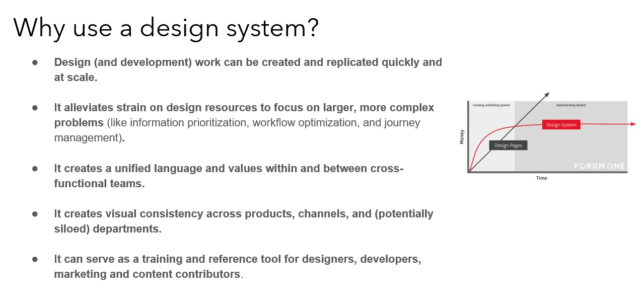
As a result, our product, brand, and engineering teams lacked a shared foundation around process, design language, guidelines, and UI pattern libraries. This created inefficiencies for each team, as well as inconsistencies within our product.
My role
As Manager of UX, I led a team of 4 designers, 1 researcher and 1 developer tasked with creating a design system for Costco Travel.
- I defined the roadmap with product management and engineering
- I staffed the effort with the right amount of UX support
- I guided the UX team with prioritization and timely feedback
- Overall, I ensured the design system evolved to meet our strategic needs.
Objectives
- Improve brand perception and user trust through consistent experiences that work for everyone.
- Align teams with a structured and guided way to build our products.
- Speed up our design and development process so we can create and test layouts much faster.
- Promote accessibility of our products by building accessibility and inclusion into our design system.
Results
As a result of implementing our design system, we have seen tremendous gains in efficiencies on our UX team. Because we can now leverage our design system when creating prototypes and mockups, we have reduced the average prototyping time by approximately 5 points per sprint, which translates to about a 25% reduction.
Additionally, we have reduced the number of questions from the development teams by almost completely eliminating styling questions. Developers can now reference the documented patterns for themselves in our design system.
Creating the vision
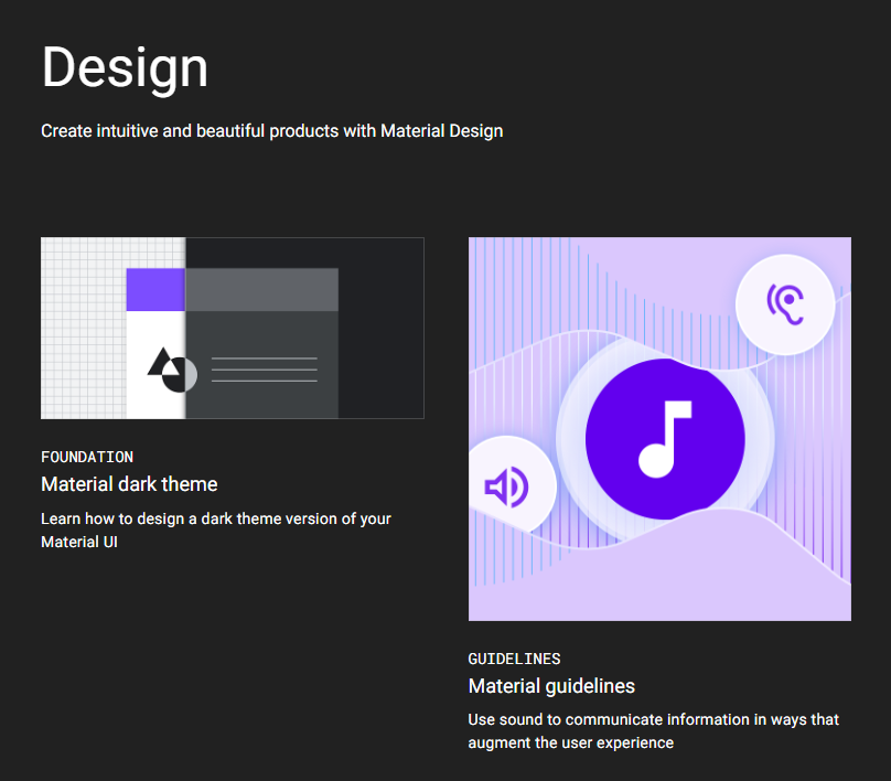
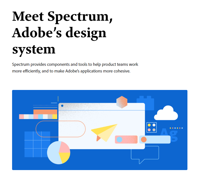
The team that I assembled to work on our design system included individuals who had previously worked at some of the top tech companies in the world, including Microsoft, Adobe, Google, and Amazon. As we were in the very initial stages of planning, we referred to several design systems such as Google's Material, Microsoft's Fluent, Adobe's Spectrum and other design systems for inspiration and best practices that we could apply in our design system.
Costco corporate had its own set of designers that were also building their own design system. While we needed to check in and align with them from time to time, our design system needed to be different. We were focused on selling vacations, not merchandise from a warehouse, and our studies showed that our users were in a different mindset when they visited the Costco Travel website.
Guardrails for decision-making
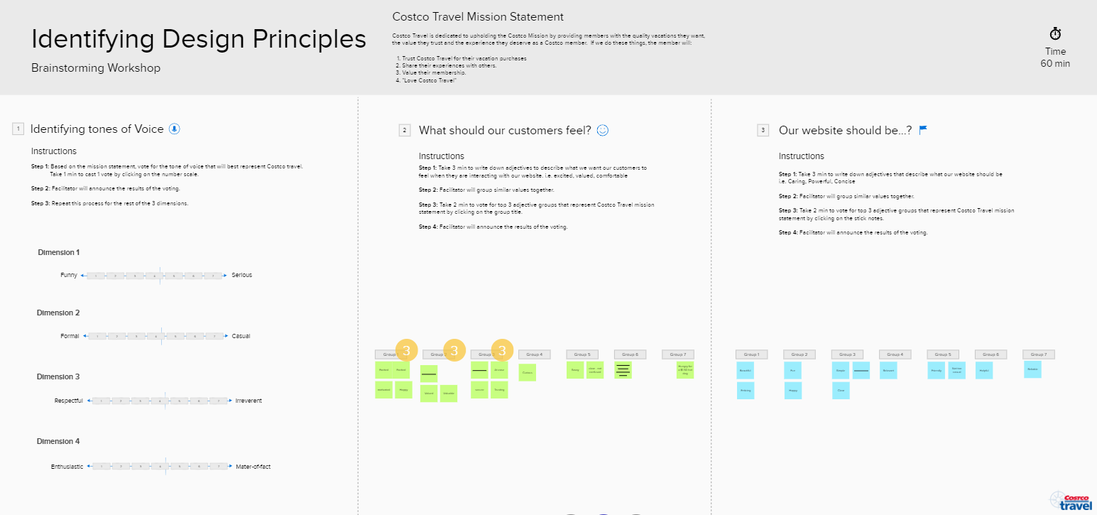
As we geared up to establish our design system, we wanted to make sure that the choices we made for our design system had solid reasons behind them. We defined guiding principles for our choices with a Product Experience Framework. When it comes to product design and development, the "what" behind designs is easy to address, but the "why" tends to be subjective.
We interviewed several users as they interacted with our site, and we did workshops within our team as well as with executives. These activities gave us valuable insight into what our products actually mean to our users, as well as clarifying how we aim for them to feel when they use them.
The guiding principles that we established as a result helped the designers to make seemingly arbitrary design decisions in a more reasoned and rational way. All design system choices were foundationally couched in the framework.
Our Product Experience Framework
Trusted
Clean
Easy
Exciting
Unreliable
Cluttered
Complex
Boring
Getting stakeholder buy in
In order to ensure the success of this project, it was important to systematically include a variety of stakeholders before we start building our design system.
We promoted the design system initiative by:
- Meeting with the executive team to kick-off the project. We created a presentation where we shared the current pain points and the anticipated benefits of the design system for the company as a whole.
- Involving engineering into the conversation early on through weekly design system meetings and workshops to collect their input.
- Getting sign-off from the marketing team for new design patterns on a bi-weekly basis.
By getting other important teams involved from the onset and as the project evolved, we promoted understanding of the project and inspired a sense of co-ownership throughout the entire process.
Taking inventory of existing site styles
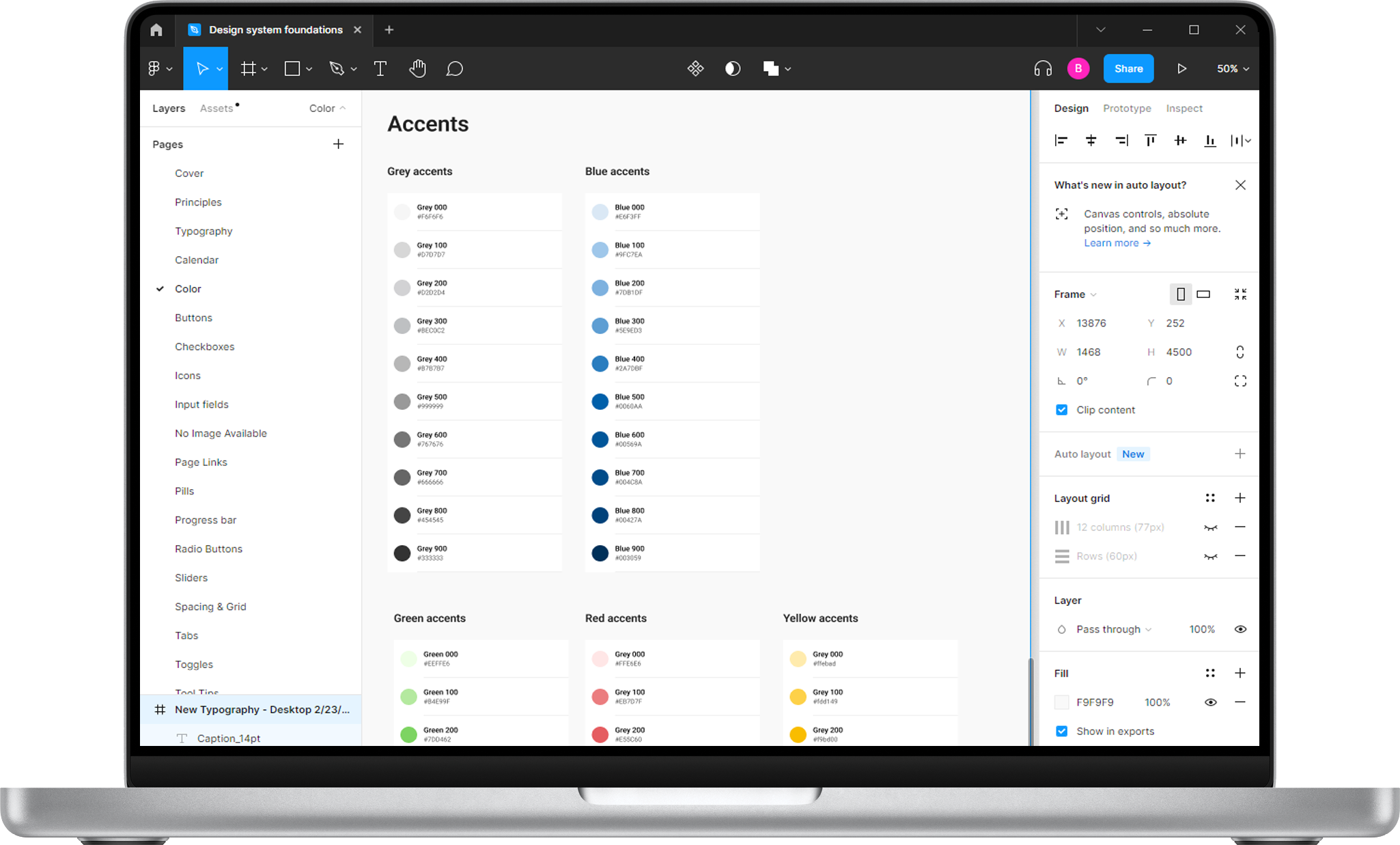
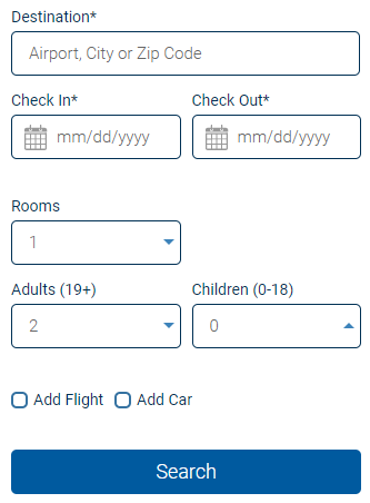
To better understand the current state of our existing design ecosystem, we started with a UI audit of our main interface components. Each designer was assigned to find all instances of a particular design system element. The plan was to screenshot unique instances of our main design assets such as typography, buttons, icons, input forms, drop downs, etc., and add them to our existing design system file in Figma.
We identified a lot of inconsistencies in our design assets, which only proved the need for a more systematic approach to documenting, communicating, and maintaining our design system.
The inventory process helped us clearly see just how many discrepancies and inconsistencies existed across our site and product. It served as a foundation for our design system work.
With the audit results in mind, we created a priority list for our design system and started assigning designers that would lead exploration and documentation for each component.
The Atomic Design approach
We decided to use the Atomic Design approach developed by Brad Frost. First we focused on foundational elements (atoms) of our design system, such as color palettes, fonts, grid, spacing, buttons, etc., and then move on to more complex blocks and pieces (molecules, organisms, templates, pages). We created all components from scratch in Figma, liberally using its variant and auto-layout functionalities.
We analyzed the instances and use cases captured during the inventory phase. We ideated on the solutions to best match the design principles we had established. We merged different variations of components to leave only the essentials.
Some principles we followed:
- We made our components responsive with the auto-layout feature in Figma, so we could reuse the components when designing for different devices or layouts.
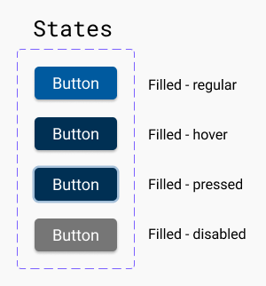
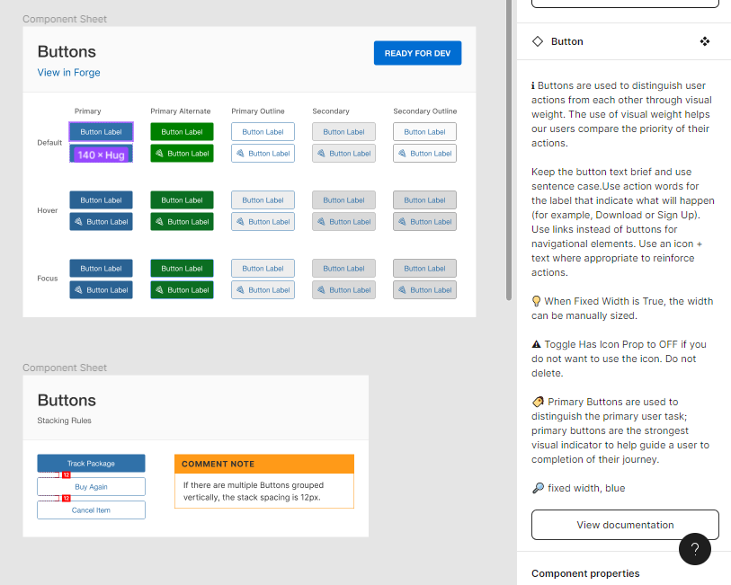
- We designed to cover all scenarios, or “states” in the system using variant states in Figma: hover, focus, filled out, error, and disabled. Using variants makes components easier to maintain, browse and swap through the sidebar menu.
Templates and Pages are still a work in progress.
Reviewing work is an important part of any design process to ensure we arrive at decisions collectively and align on details such as component design, documentation, and tools. For this project, we checked in weekly with our front-end developer who socialized our work with the engineering teams. We discussed the direction and progress of work. We also set up a monthly meeting with marketing to sync with them on the design system updates. These practices allow us to collect everyone’s perspective and bridge the gap between design, engineering and marketing.
Accessibility
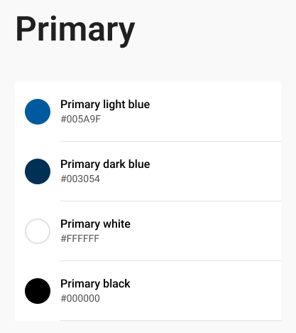
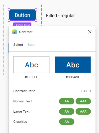
As we were updating our components, we were also able to address both visual and structural accessibility issues. Each component we designed with accessibility in mind and we complied fully with WCAG AA accessibility standards. Font size, element spacing, and many other variables were updated across the board for improved clarity and wayfinding. Information architecture was better enforced to assist with site readers and to provide a better browsing and viewing experience to those with a variety of accessibility needs and concerns. For example, we were very intentional with our choices of color to achieve sufficient text contrast so that users with low vision could see and use all of our components.
Governance and documentation
High-quality component documentation is crucial to an effective library allowing everyone to quickly and efficiently make consistent decisions. We created detailed documentation that would support every single aspect of our design system, and also be organized, consistent, and easy to use.
Component library
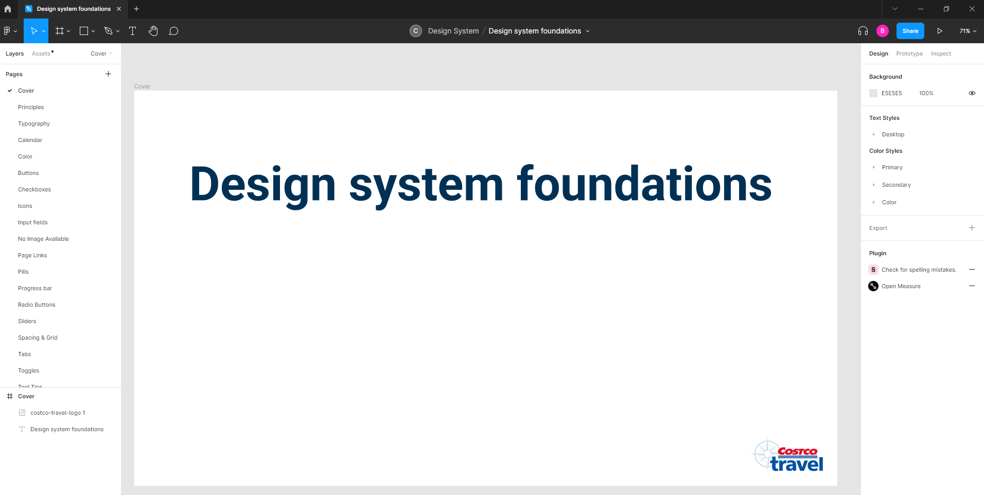
Once the Figma components were approved, we move them to a Figma design system file, a shared library of assets that our team can leverage to drag and drop components while working on their designs.
Component documentation
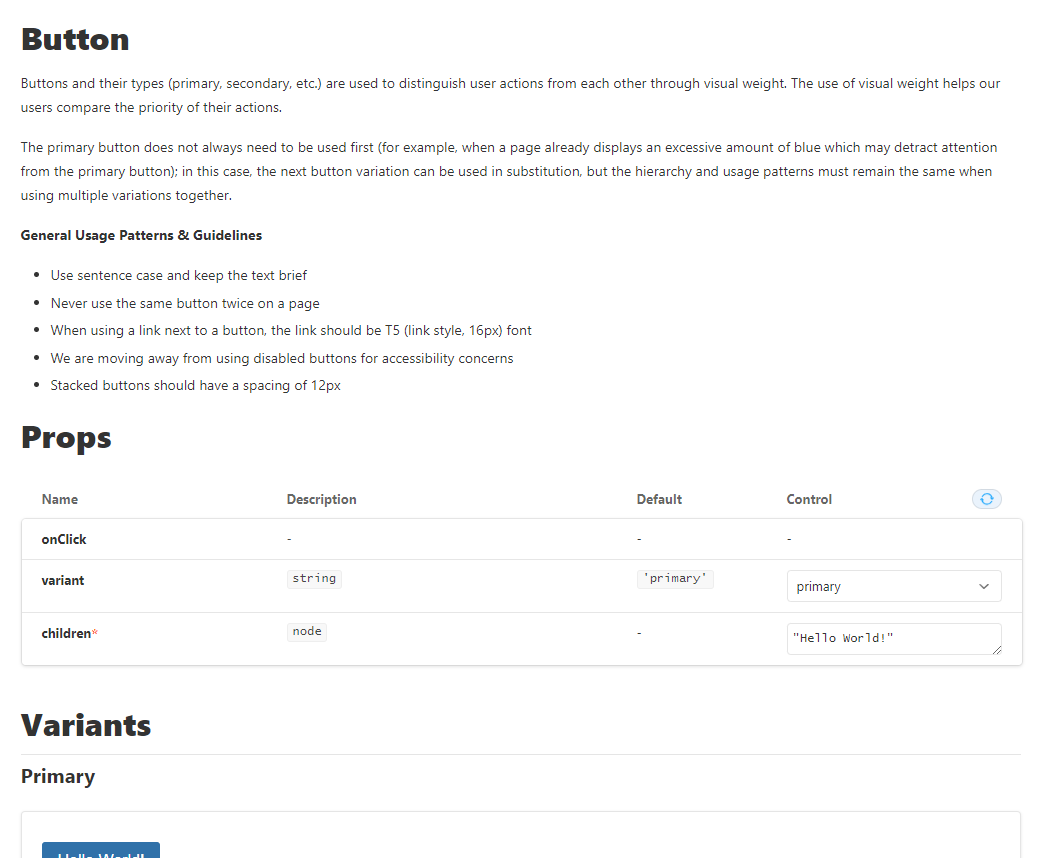
We also created documentation for our design system in The Forge and used a plugin for Figma to sync the two together so that the documentation is always available in the component library. The documentation is a collection of guidelines and rules for those components. At a high level, most of our component documentation includes:
- Introduction with component description
- Component construction
- Component states
- Behavior
- Usage patterns
- Accessibility guidelines
- Examples of components in different contexts to demonstrate how design patterns would be applied in real products and specific use cases
Developer code library
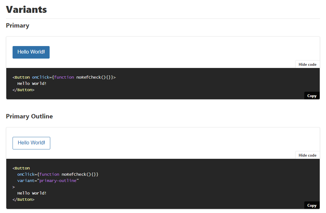
With the help of our front end developer, we built out a code repository within the Forge for the developers. Having the design patterns established in code ensures consistency in implementation. It also allows us to document use cases as stories and easily find, share and reuse them. Like the rest of the design system, this is still a work in progress.
The impact of the Costco Travel Design System
As a result of implementing our design system, we have seen tremendous gains in efficiencies on our UX team. Because we can now leverage our design system when creating prototypes and mockups, we have reduced the average prototyping time by approximately 5 points per sprint, which translates to about a 25% reduction.
Additionally, we have reduced the number of questions from the development teams by almost completely eliminating styling questions. Developers can now reference the documented patterns for themselves in our design system.
Next Steps
The design system is an ongoing project. We iterate, change and learn throughout the process. So far, we have built a set of basic components, which has been game-changing for our team in terms of efficiency, as well as consistency, and standardization.
But our work is not over - there is still ongoing work. We need to continue growing and revisiting our design system on a regular basis.
- We will continue to grow our component library by supplementing it with more complex components and templates.
- We will cultivate processes and best practices for maintaining the documentation to ensure that our library stays up to date and perfectly in sync both on the design and code side.
- We will raise awareness across the teams and promote adoption and contribution to the documentation.
- We will continue to test the components on compliance with guidelines and accessibility standards.
Lessons learned
Design systems are living things.
Design systems are constantly evolving and they require a dedicated team actively involved in their growth and maintenance. Their adoption and cross-team buy-in should be promoted cotinually to ensure a common design language that is familiar and consistent.
Stakeholders need input.
Getting buy-in at all levels of the organization from the beginning helped the team to work efficiently and cleared the path from competing priorities. It also ensured adoption across multiple cross-functional teams and improved the overall quality of the design system.
Keep an eye on accessibility.
You can't build a great design system without complying with accessibility standards 100%. Making sure that the team was familiar with the WCAG standards early ensured less rework further down the line.
