Costco Travel Search Widget
Costco Travel's search widget is the primary entry point into the website and a key driver for the company's revenue.
But searches for Costco Travel's new products were lower than expected, and so my UX team came to the rescue.

Context
In many ways, Costco Travel's search widget is the "face" of the company that lets our members know what kinds of products and deals they can take advantage of to get a great value on their vacation.
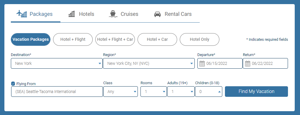
The search widget wasn't meeting business expectations. Costco Travel had recently added new product lines - "Hotel Only" and "Dynamic Packages" (Hotel + Flight; Hotel + Flight + Car; Hotel + Car) - to complement the curated packages that were the "bread and butter" for the company. Searches for the new products were lower than expected.
My role
As Manager of UX, I led a highly-scrutinized effort to redesign the search widget for Costco Travel's website.
- I defined the roadmap with product management and engineering.
- I built a coalition of supportive stakeholders to help me navigate a highly political problem space.
- I staffed the effort with the right amount of UX design & research support.
- I guided the UX team with prioritization and timely feedback.
- Overall, I ensured the search widget evolved to meet our strategic needs.
Objectives
- Increase the number of searches performed from Costco Travel's search widget in general.
- Increase awareness of Costco Travel's new product offerings.
- Avoid any disruptions to "Vacation Package" revenue.
Results
As a result of the search widget design improvements, searches increased by over 8%.
The increase in search behavior has contributed to an increase in bookings of over 5% compared to pre-pandemic levels.
Laying the right foundation with research
The UX team's cross-functional partners in product and engineering wanted to move quickly. They wanted to boost sales of the new products and didn't want to take time for user research. But I knew that this was the first time that the search widget had been scrutinized by a proper UX team. If the team was going to design an effective solution, we needed to better understand the problem we were trying to solve. I ensured that we followed the right product development process, right from the get-go, by bringing in our user researcher to conduct usability studies and competitive research to get us started on the right path.
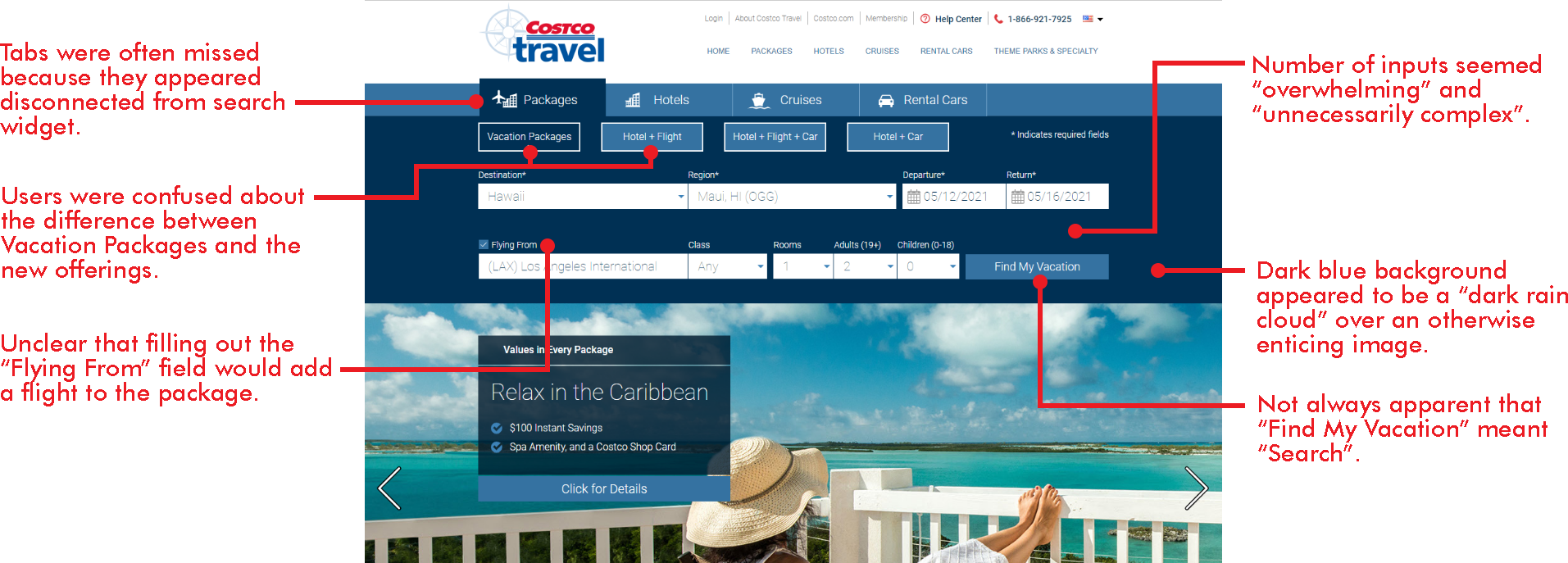
Our research phase proved to be invaluable. In head-to-head matchups, users only preferred our search widget between 10-20% of the time vs competitors like Expedia, Booking.com, Google Travel, and others. Here are some of the reasons:
Defining problems
Stakeholders were all over the board in terms of what they expected to come out of this project. Besides refreshing the search widget itself, some expected a full home page redesign, others expected a new search results page. They similarly were not aligned on how we would measure success.
I drove a series of workshops to get our stakeholders aligned on what we were trying to accomplish. We defined and agreed on what the business problems were using business metrics, as well as the user problems with the foundational research that we had conducted.
We also agreed that we would use percentage of home page sessions that resulted in each vertical search as our primary success metric, and we set up our analytics to collect this information.
Output of problem definition workshops

Ideation, accountability, and design reviews
As we moved into the ideation phase, I needed to make sure that our designers and researcher were collaborating effectively to drive the right solutions. I also needed them to be accountable for their work without micro-managing the project.
I set up weekly project syncs, design reviews and prep time with the designers and researcher where they would formally present their ideas to each other and discuss how well their designs were solving the problems we had uncovered. We were very tightly aligned on the direction of the project and what we would be presenting to stakeholders each week.
Introducing AB testing
Since the culture at Costco Travel up to this point was to simply pick the design that stakeholders liked best, it was important to establish more rigorous ways to approach decision making, so I introduced the idea of A/B testing.
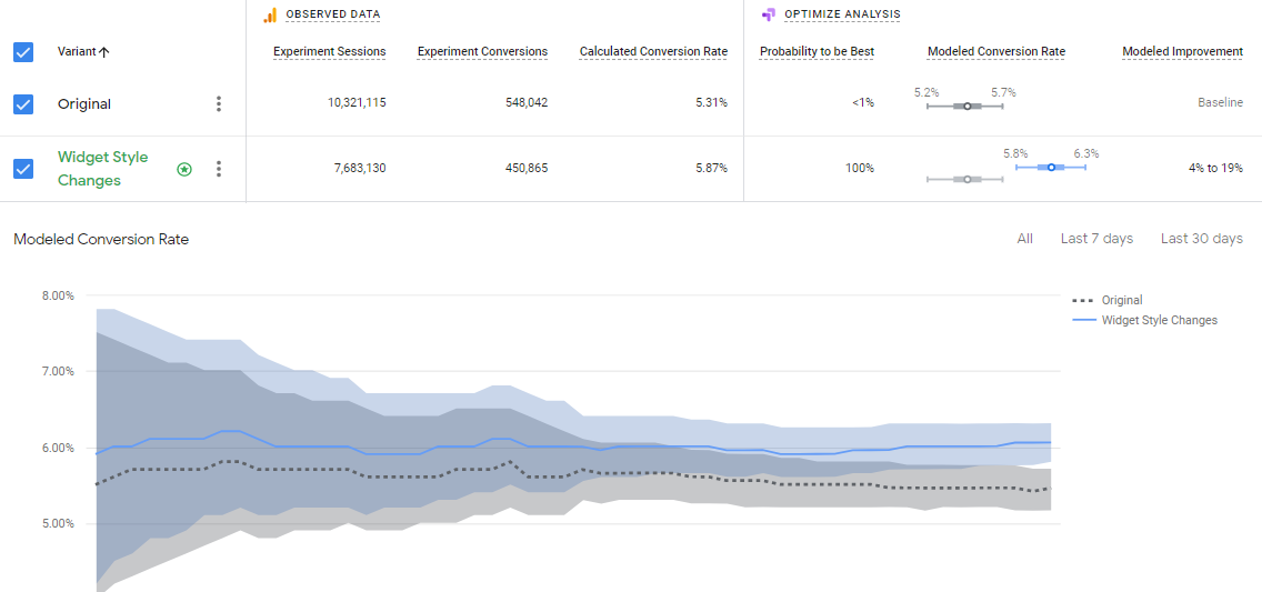
We decided to center our first A/B test around improving the styles on the search widget. We made the background white and softened the corners on the input fields. Heuristically, we knew that these changes should lead to increased engagement. It was a great opportunity to show how changes in a design can yield impressive results.
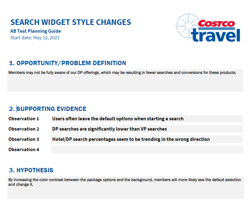
I led stakeholders through the process of setting up an A/B test correctly. We chose our dependent and independent variables, established our hypothesis, and leveraged Google Optimize to run the test. I created an A/B testing worksheet to guide our discussions, not just for the initial tests, but for all A/B tests going forward. This worksheet and process has now been used dozens of times to make decisions about the direction of the website.
The first A/B test was a tremendous success, with searches improving by nearly 6% across the board. Stakeholders were thrilled.
Incremental improvements
Costco Travel stakeholders were reluctant to give up old ways of making design decisions, so we had to move slowly and prove that every change we were making was valuable.
We went through several rounds of iteration following a very predictable pattern: we identified a very specific problem to solve from our foundational research, we designed a solution for that problem, we tested the usability of the design solution to make sure that it produced the desired qualitative results, then we did an A/B test to show that it was the right solution at scale. Even though this process took far longer than it might have at an organization with more UX maturity, it was the right thing to do in our situation so that we could win over stakeholders and have them trust us more implicitly further down the line. Here is a sampling of some of the impactful iterations we implemented:
1. Improved visual design of search widget
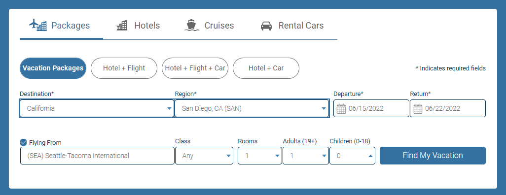
Our foundational research indicated that users found the search widget to be "corporate" and "uninviting", with one user describing it as a "dark rain cloud" hanging over their vacation. We changed the background color to white, updated the style of the tabs, and rounded the corners on the pill boxes and input fields. Implementing these visual design changes resulted in an 5.4% increase in searches across the board.
2. Put new products in first position
Our foundational research also revealed that users did not see our new offerings because they were only found under the 2nd pill box after the default pill box. When we put the new pill box into the default first position, we increased searches for our new products by 5.8%. Interestingly, searches for our legacy products not only maintained, but they also increased by 1.6%.
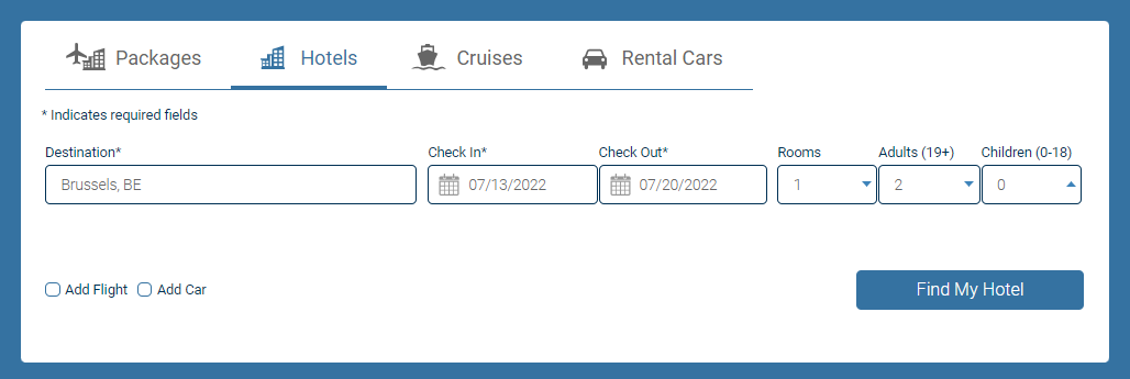
3. Hotel-only single line search
Users also complained that our search widget appeared to be unnecessarily complex with many fields to fill out, especially compared to competitors like Expedia and Priceline. We reduced the perceived complexity by consolidating the input fields into a single line for our hotel-only product, resulting in a 3.8% increase in hotel searches. This proved the single-line search concept and laid the foundation for making similar changes to our higher value package searches.
All these minor iterations helped us prove, piece by piece, that the changes we were making would drive significant, measurable business improvements. This approach was definitely an exercise in patience, but it was important to go throught because we were ultimately able to show that "slow and steady wins the race", because we ended up earning the implicit trust of stakeholders in our methods many times over.
Re-packaging the package search
Having proven our value through our incremental iterations, our UX team was ready to take on the biggest and potentially most controversial problem that were identified in our foundational research: users could not differentiate between the old, curated offerings and the new, dynamic offerings. Since packages are the bread and butter of Costco Travel, and we needed to get this right. By way of explanation:
- The old, curated offerings are negotiated at an individual hotel level by Costco buyers to get the best deal for the member. They generally include extras that can not be found on other travel sites. These packages are available only in certain, limited destinations.
- The new, dynamic package contracts are negotiated with an entire hotel chain by Costco buyers with an entire hotel chain and are more comparable to what is available on other travel sites. These packages are widely available in hundreds of destinations.
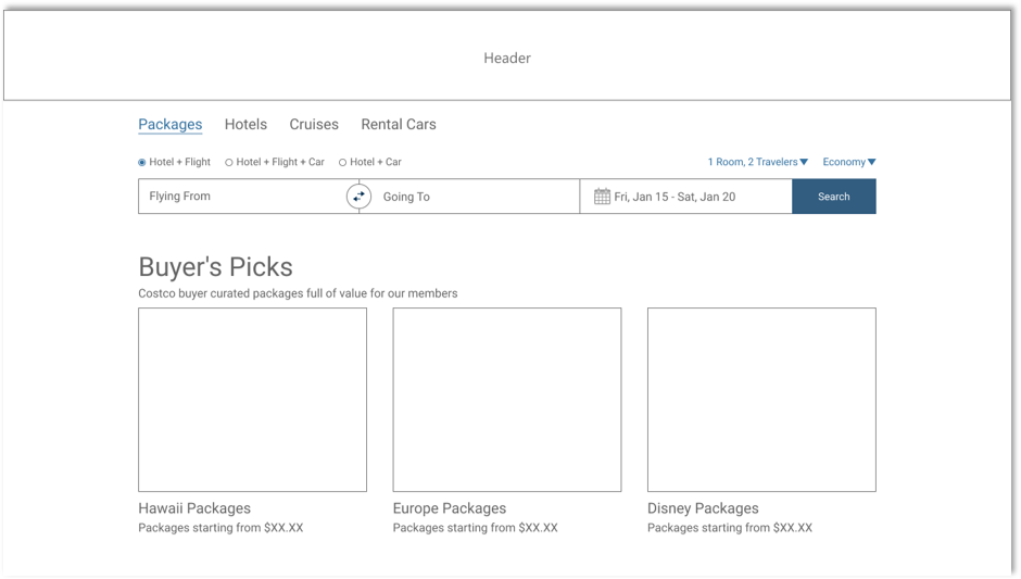
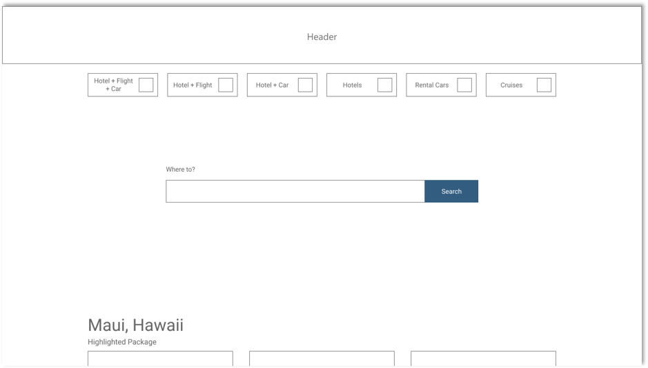
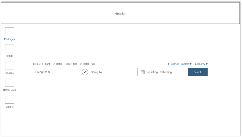
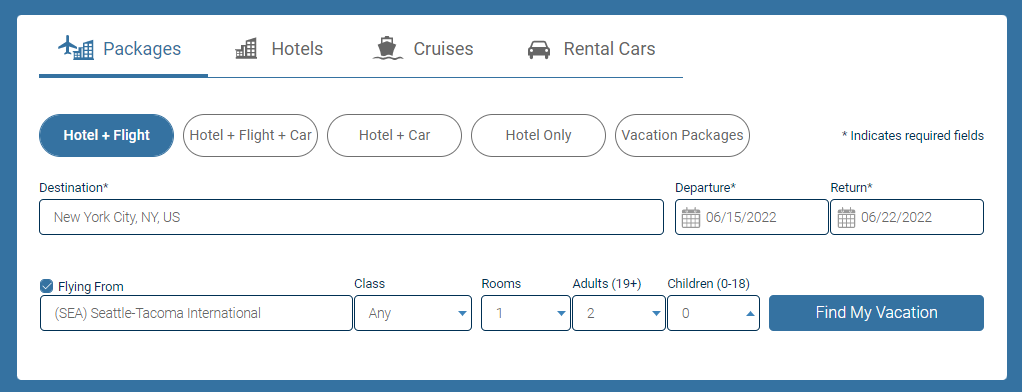
Teaching users to distinguish between the 2 products in the context of the search widget proved to be futile. The products were just too similar, and the differences were too nuanced. After completing dozens of studies and design iterations, we recommended that the search for these 2 products be combined into a single entry point, removing the pill boxes altogether. Users would be routed to the appropriate search result based on the destination they enter.
Eliminating the pill boxes reduced the cognitive load users experienced by not requiring them to select between two products that they did not distinguish between. We also took the opportunity to consolidate to a single line search based on the success of the hotel-only search widget.
Improving business outcomes
AB testing showed that the new search widget was performing well for our intended purpose. Searches for the new offerings increased by 7.2%. However, the old, curated offerings saw a small dip in searches of 0.4%. Even though overall the outcomes were positive, business would not accept the decrease and we needed to address it.
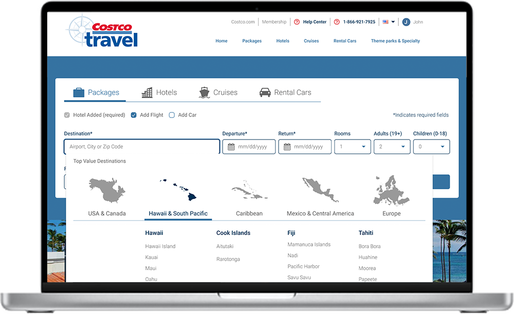
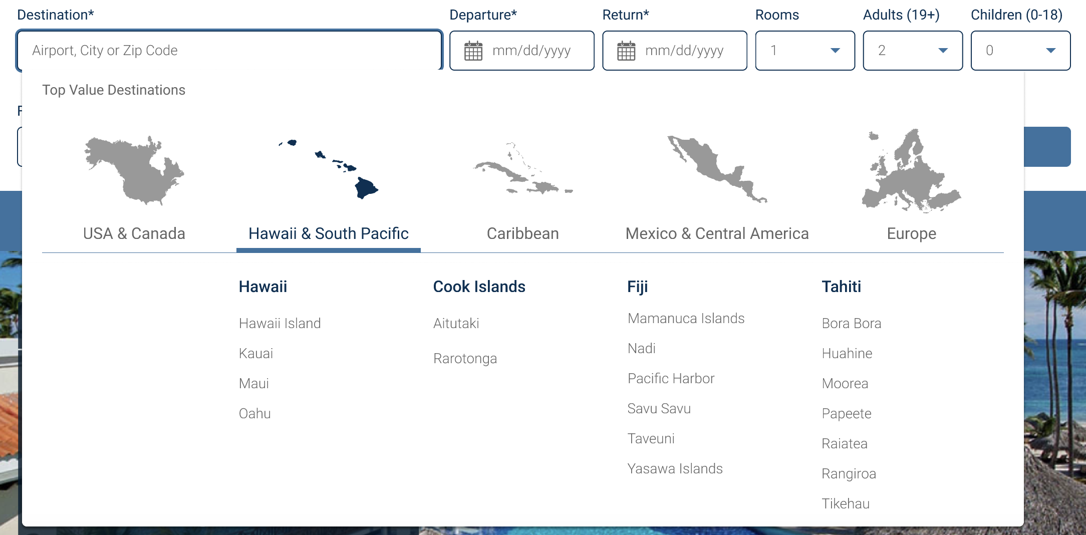
I came up with the concept of putting a spotlight on the old offerings by allowing users to select the curated destinations from a graphical dropdown that occurred when the destination field was in focus. Users could still type in whatever destination they wanted, but they would also be prompted to choose something off the list as the "top value" destinations.
The design solution worked. We maintained the increased search level on the new packages from the last test, and we also increased searches on the old packages by 2.1%. We filled the gap and the design was *finally* implemented.
The impact of the Costco Travel Search Widget redesign
After implementing all these changes to the search widget, we increased the number of searches that Costco Travel's search widget yields by over 8%. This improvement has had downstream effects on bookings, which are beating pre-pandemic levels by nearly 10%. Costco Travel is posting record-setting sales and revenue, due at least in part to the changes my team designed and tested.
There is still more work to do on the search widget. My team is continuously finding opportunities to remove friction and get users into the search and booking workflow. But we are in a much better place today, both in terms of usability and business outcomes, than we were when we started the project.
Lessons learned
Level up stakeholders in UX
Stakeholders may have varying levels of UX maturity, and it's important to use the many research tools that we have at our disposal to win them over. I took the time that each stakeholder needed to bring them along for the ride, which has paid off in big ways ever since.
Mixed methods matter
In this project, some of our stakeholders were more convinced by showing user highlight reels, while others were more persuaded by the A/B test results. Being able to customize my messaging using both qualitative and quantitative research helped me to gain the buy-in I needed to move the project forward.
Take time for research. Always.
Each user study that we did on each iteration of the search widget led to more insights on how we could improve the product. This process led us in directions that we could not have anticipated at the beginning of the process, and helped us to build something truly useful and engaging for our users.
